64 real before & afters

Home renovation ideas,
shown in real rooms

Not a moodboard of somebody else’s house. Every idea below is a photograph of a real room with a real change rendered into it — what moved, and why it reads well. Browse by room, by style, or by how far you are willing to go, then try any of them on a photo of your own home.

Kitchen

Kitchen renovation ideas

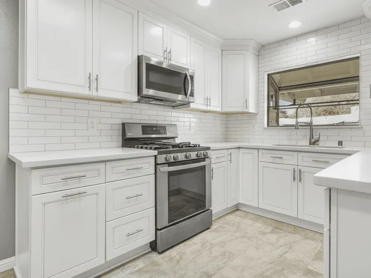
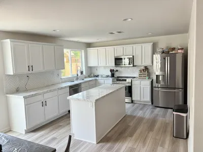
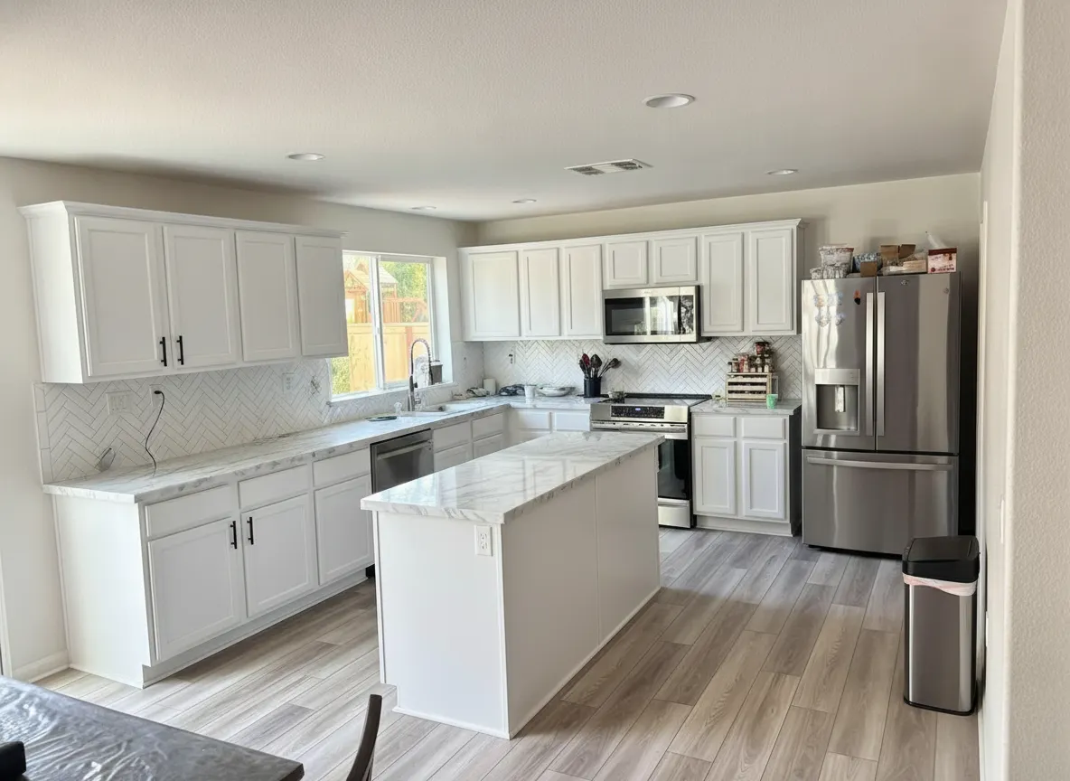
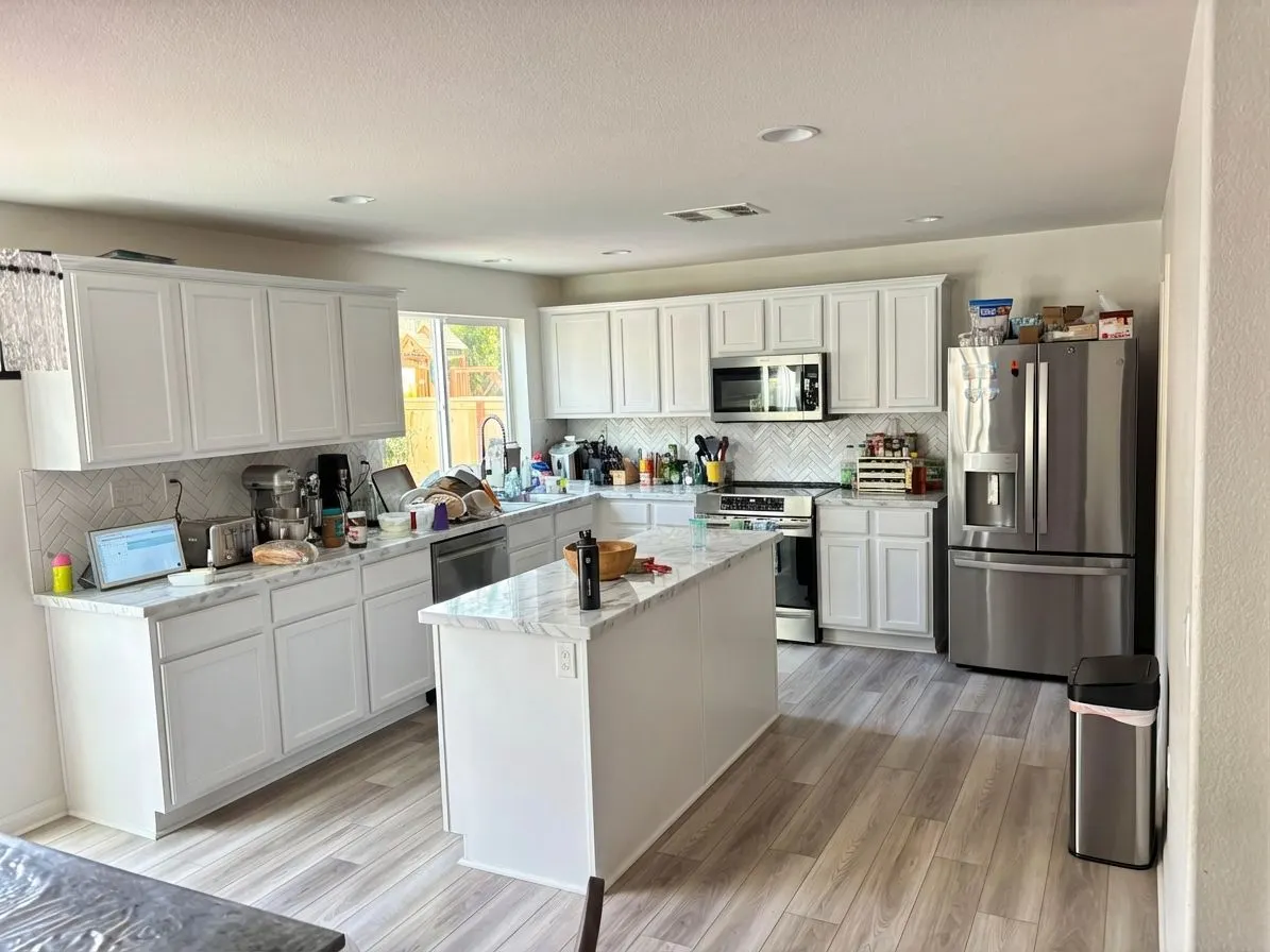
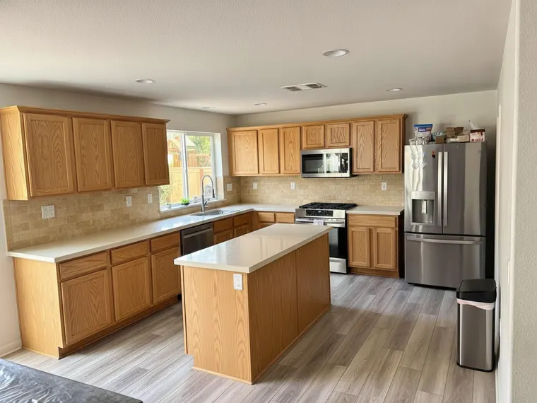
The kitchen is the room where the same layout can read builder-grade or expensive depending on four decisions: cabinet colour, countertop, hardware and backsplash. Every render below is the same lived-in kitchen — groceries still on the counter — with those four dials turned differently.

After: Modern white
Before: The real kitchen
The real kitchen Modern white
Drag the handle. Same window, same island, same ceiling — only the finishes moved.
Kitchen renovation idea: warm white oak cabinetry with honed stone countertops

Warm white oak and honed stone

What changed Cabinet doors to natural white oak, countertops to honed stone, hardware to brushed brass, backsplash to warm limestone.

Why it works Oak keeps the warmth a single-window kitchen loses the moment you go all-white. Honed stone forgives crumbs and water marks in a way polished slab does not.
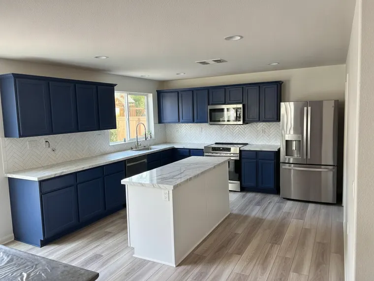
Kitchen renovation idea: deep navy cabinets with white marble countertops and slab backsplash

Navy lowers with a marble slab backsplash

What changed Base cabinets to deep navy, uppers and counters to white marble, backsplash run as one marble slab, hardware to brushed gold.

Why it works Dark on the bottom and light on top makes a low ceiling read taller. Running the counter material up the wall deletes the grout lines, which is the busiest thing in most kitchens.

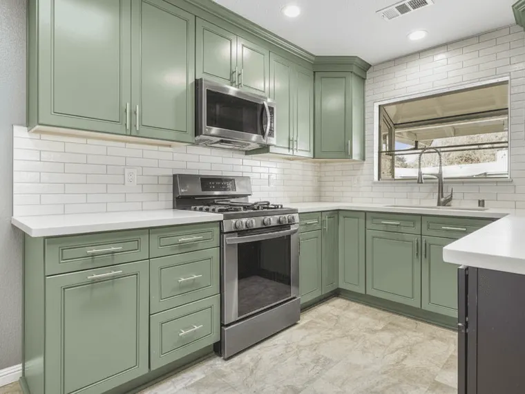
Kitchen renovation idea: existing cabinets repainted sage green

Sage green on the cabinets you already own

What changed Nothing but the cabinet colour. Same boxes, same doors, same counters, same appliances, same layout.
Why it works This is the cheapest change on the page and one of the loudest. If your carcasses are sound, colour is a weekend and a few hundred dollars — see the whole decision worked through in the cabinet colour guide below.
Kitchen renovation idea: dark espresso cabinets repainted classic white

Classic white, if you are selling

What changed Dark espresso cabinets repainted classic white. Everything else untouched.

Why it works Espresso reads 2008. White reads neutral, which is what you want when the next person has to picture their own things in it rather than admire yours.

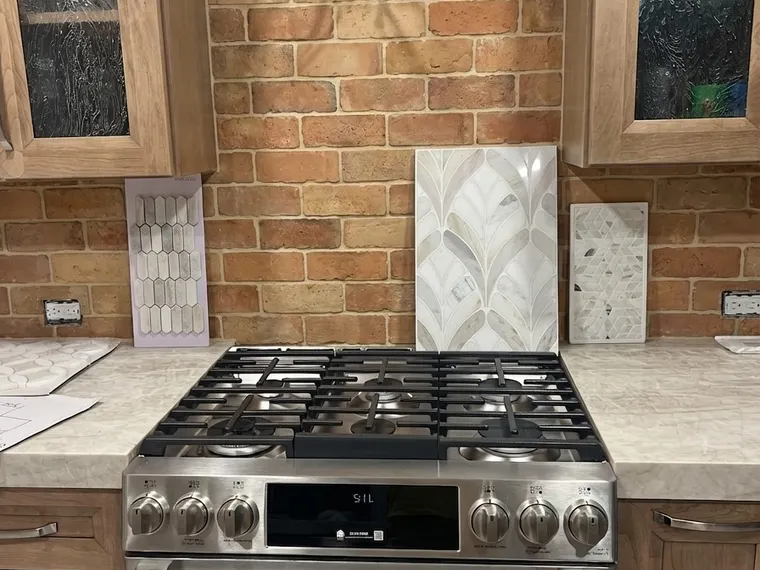
Kitchen renovation idea: terracotta tile backsplash on honey oak kitchen

Terracotta backsplash, nothing else

What changed Only the bare backsplash strip on a mid-project honey oak kitchen. Cabinets and counters left as they are.

Why it works A backsplash is roughly thirty square feet and it sets the whole kitchen’s temperature. It is the smallest surface with the biggest say — worth trying five colours before you buy one.

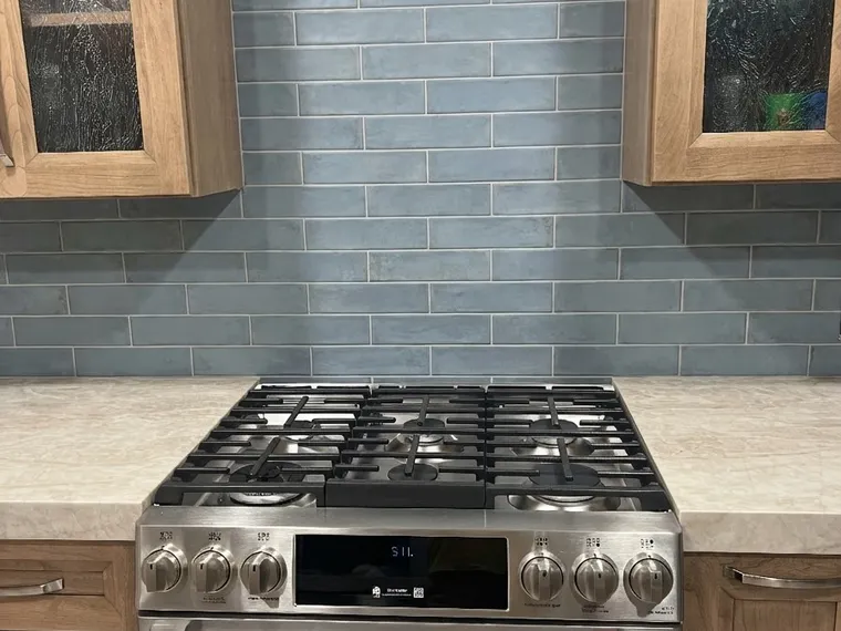
Kitchen renovation idea: dusty blue tile backsplash with honey oak cabinets

Dusty blue, same oak

What changed The same bare backsplash, in dusty blue instead of terracotta.

Why it works Honey oak has a strong orange cast. A cool blue sits opposite it and calms the whole room down; terracotta leans into the orange instead. Neither is wrong — it is a mood decision, and this is what it looks like made twice.

Bathroom

Bathroom renovation ideas

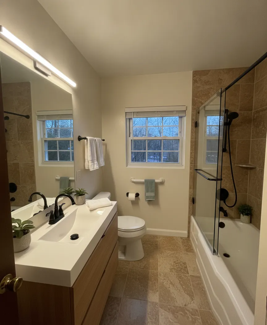
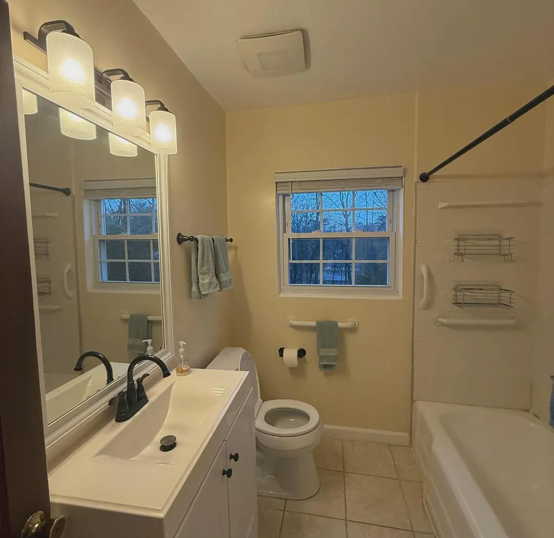
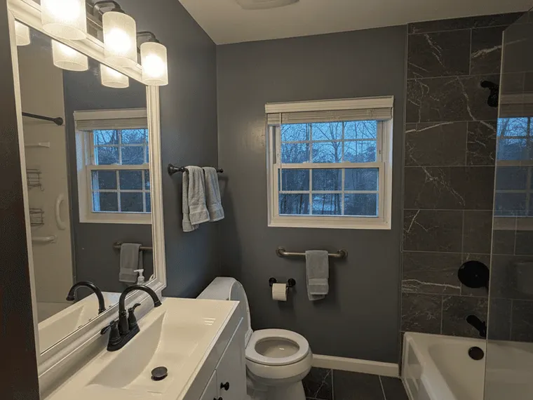
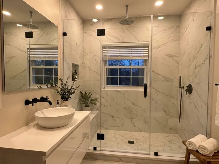
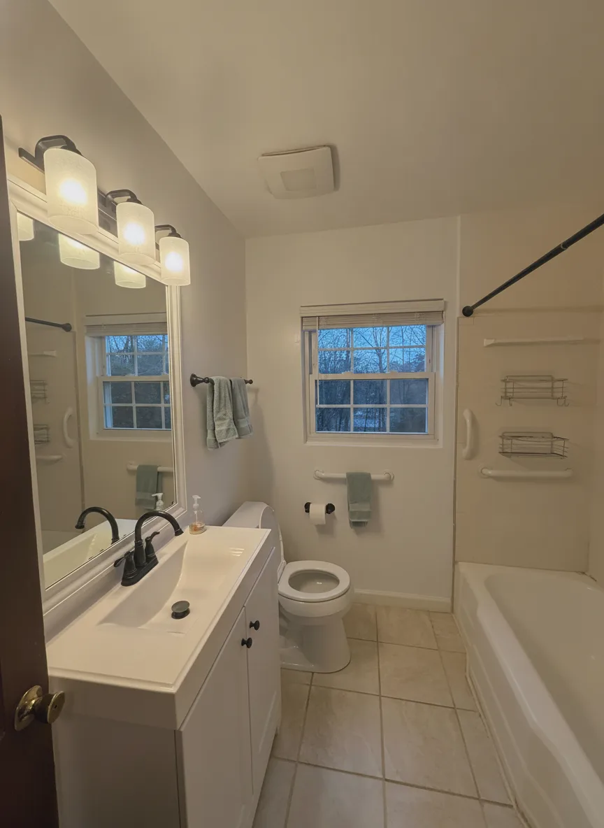
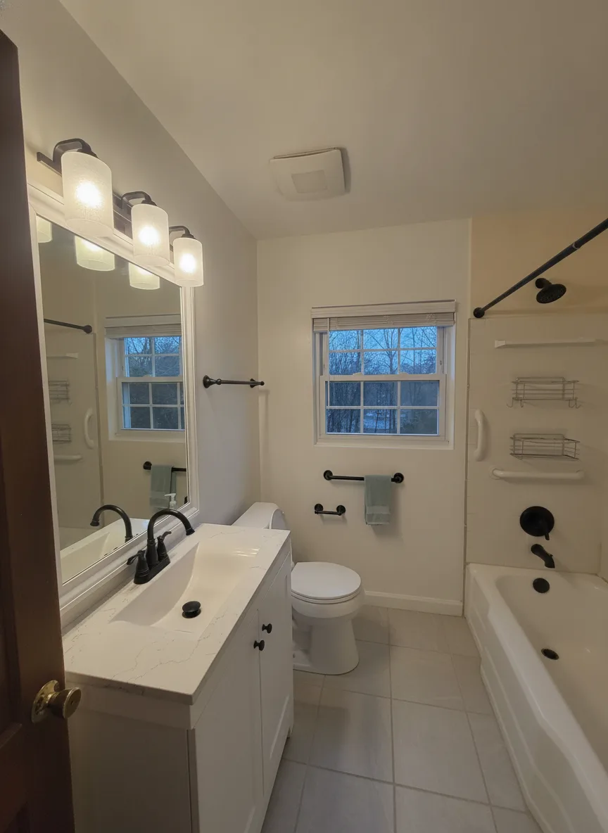
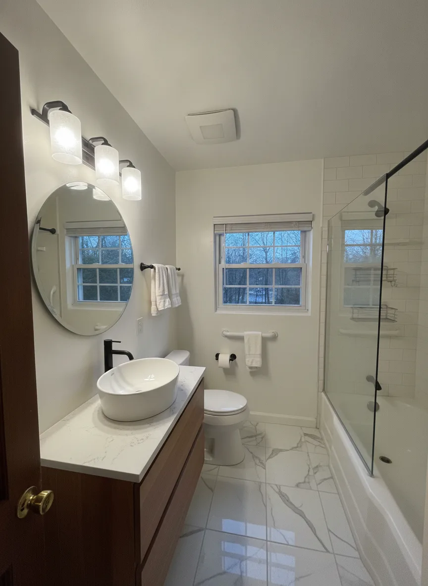
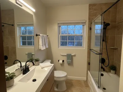
Bathrooms are small, which cuts both ways: material costs stay low, and every surface is within arm’s reach of every other one, so a mismatch is impossible to hide. All six renders here started from one dated three-piece bathroom — yellow walls, bronze fixtures, beige floor, tub-shower combo with a curtain rod.

After: Warm stone spa
Before: The real bathroom
The real bathroom Warm stone spa
Same window, same tub position, same door. The tile, vanity, fixtures and shower screen are what moved.
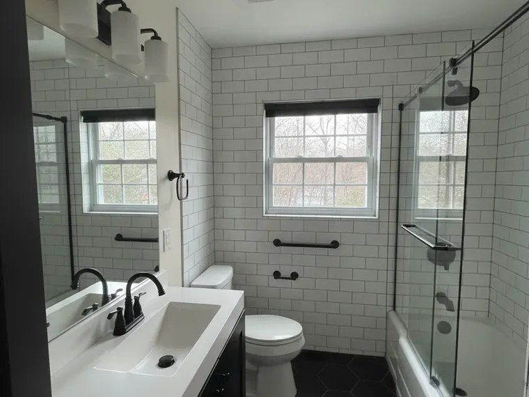
Bathroom renovation idea: white subway tile with dark grout and a black vanity

Black and white, dark grout

What changed White subway tile with dark grout, a black vanity under a white stone top, matte black fixtures throughout.

Why it works Dark grout is the practical choice nobody tells you about — it hides the wear that turns white grout grey within two years. The black-and-white pairing is also the least likely thing on this page to date.

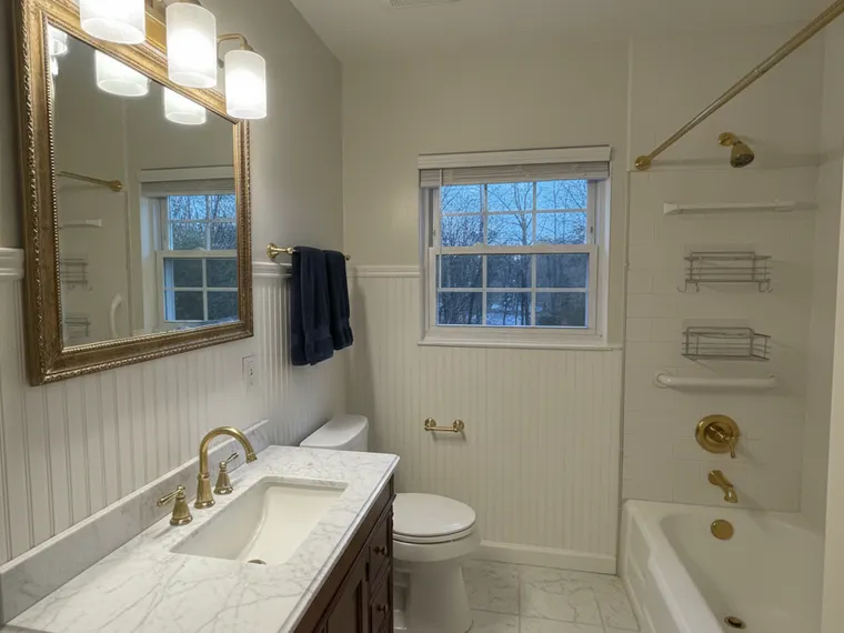
Bathroom renovation idea: white marble tile with beadboard wainscoting and brass fixtures

Marble, beadboard and polished brass

What changed White marble tile, beadboard wainscoting to chair height, a furniture-style vanity with a marble top, polished brass fixtures.

Why it works Wainscoting gives a small bathroom a horizontal line to break the height, which stops it reading like a tiled box. Brass warms marble up — the same room in chrome reads clinical.

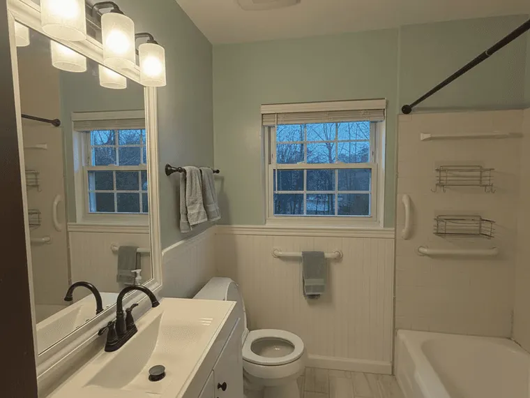
Bathroom renovation idea: coastal bathroom with pale green and white finishes

Coastal, for a bathroom with no window

What changed Pale sea-green tile, white vanity, brushed nickel fixtures, light timber accents.

Why it works Light cool colours make a windowless bathroom feel less like a cupboard. The trade is that they need good light to not go grey — worth checking against your actual bulb temperature.

Bathroom renovation idea: dark moody modern bathroom with charcoal tile

Moody modern

What changed Charcoal large-format tile, a dark timber vanity, black fixtures, warm concealed lighting.

Why it works Going dark in a small room is the opposite of the usual advice and it often works better, because you stop trying to make a cramped room feel big and start making it feel deliberate.

Bathroom renovation idea: small bathroom makeover with a wall-hung vanity

Small bathroom, treated as small

What changed A wall-hung vanity, a frameless screen instead of a curtain, tile taken to the ceiling.

Why it works Three moves that buy visual floor: getting the vanity off the ground, replacing an opaque curtain with glass, and removing the horizontal line where tile normally stops.

Living room

Living room ideas

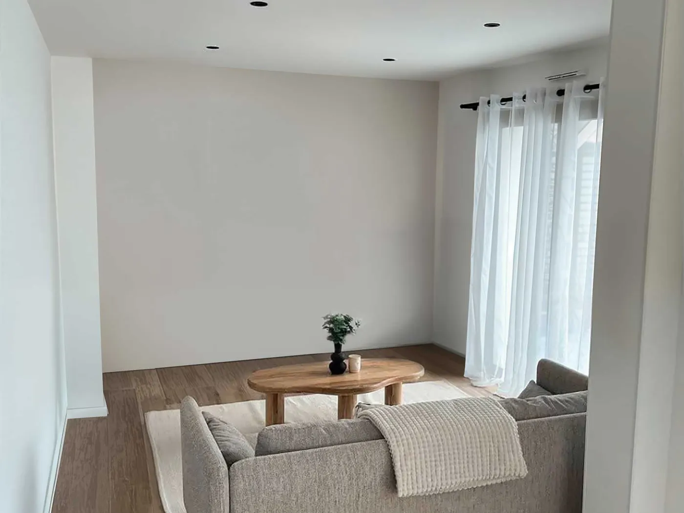
Living rooms rarely need building work. They need a decision about what the room is for — hosting, slumping, or looking good in photographs — and then furniture that admits it. These are five answers to that question, all rendered into the same real room, same window, same blank wall.

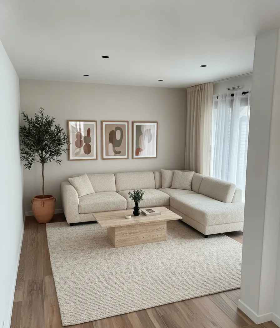
After: Warm minimal
Before: The real room
The real room Warm minimal
One photo, five directions. Everything below is this room — the window and the blank wall never move.
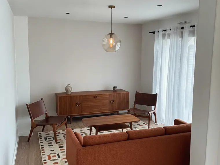
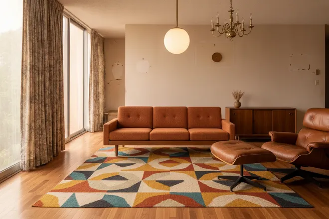
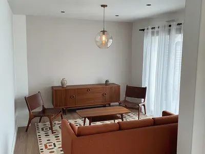
Living room idea: mid-century modern with a low walnut sofa in rust wool

Mid-century, walnut and rust

What changed A low walnut-framed sofa in rust wool, two leather lounge chairs, a walnut sideboard on the blank wall, a globe pendant, a geometric rug.

Why it works Low furniture makes a standard eight-foot ceiling read generous. The sideboard is doing the real work — it gives the blank wall a job instead of leaving it as a gap.

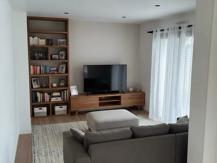
Living room idea: family room with a grey performance-fabric sectional and built-in shelving

A family room built to survive children

What changed An L-shaped sectional in dark grey performance fabric facing a wall-mounted TV over a low console, deep built-ins on the blank wall, a washable flat-weave rug.

Why it works This is the version most people actually need and few pin. Performance fabric and a flat-weave rug are the two decisions that determine whether you still like the room in three years.

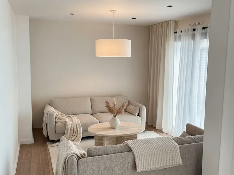
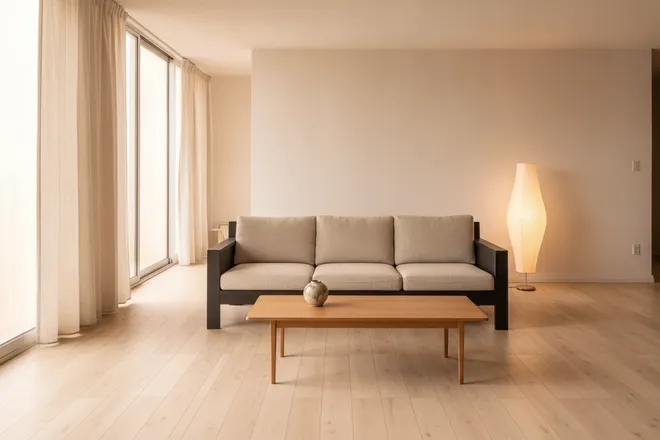
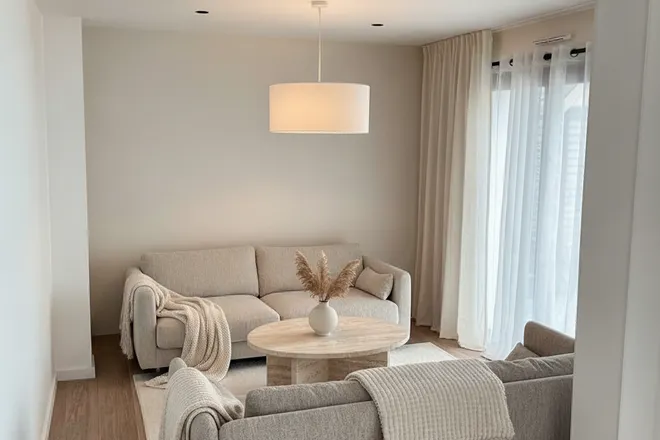
Living room idea: warm minimalist with a boucle sofa and travertine coffee table

Boucle, travertine and linen

What changed A boucle sofa, a travertine coffee table, linen curtains, cream and sand tones throughout.

Why it works Warm minimal only holds together if the textures disagree — nubby boucle against smooth stone against loose-weave linen. Match the textures and the same palette goes flat.

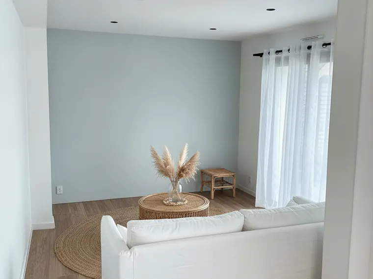
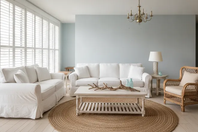
Living room idea: light coastal with a slipcovered sofa, rattan and a jute rug

Light coastal without the theme

What changed A slipcovered white sofa, rattan accents, a jute rug, pale blue-grey walls.

Why it works Coastal goes wrong when it becomes a costume. Here it is three materials and a wall colour — no shells, no rope, no driftwood signage.

Bedroom

Bedroom renovation ideas

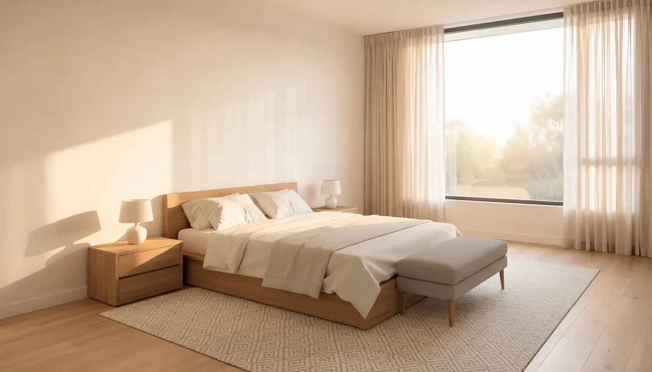
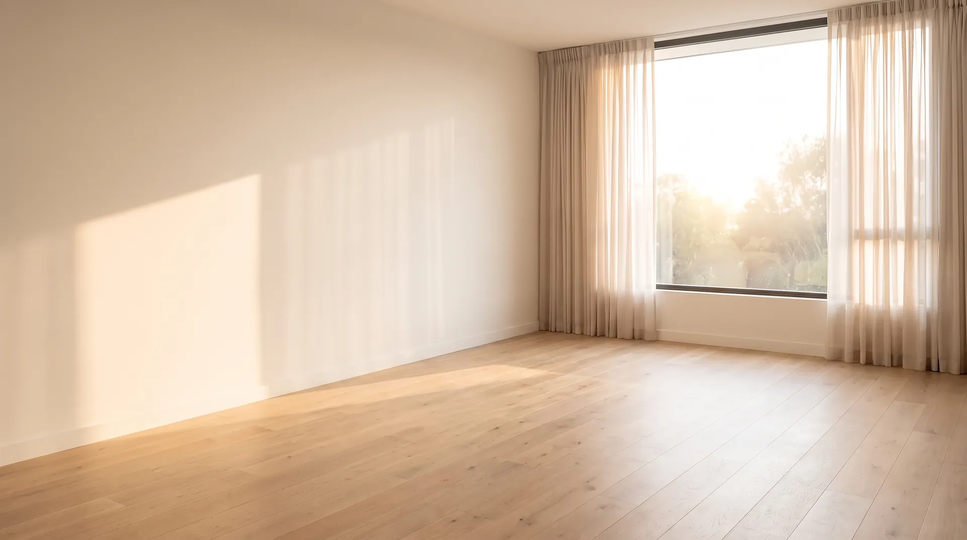
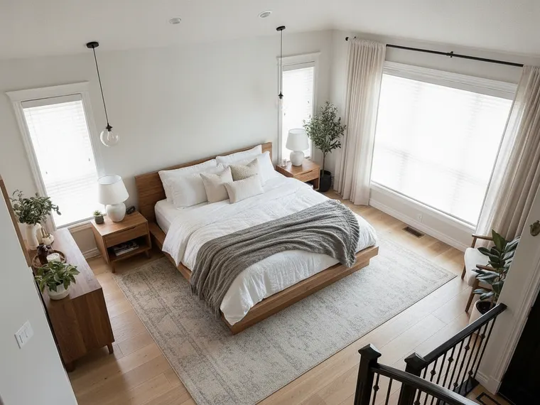
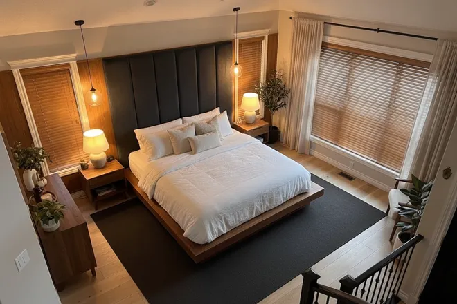
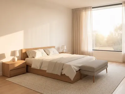
An empty bedroom is the hardest room to picture and the easiest to render, because there is nothing to remove first. The featured pair below is a genuinely bare spare room — carpet, curtain rail, one window — furnished four different ways.

After: Calm modern
Before: The empty room
The empty room Calm modern
Nothing here was measured or modelled. One photo from the doorway is the entire input.
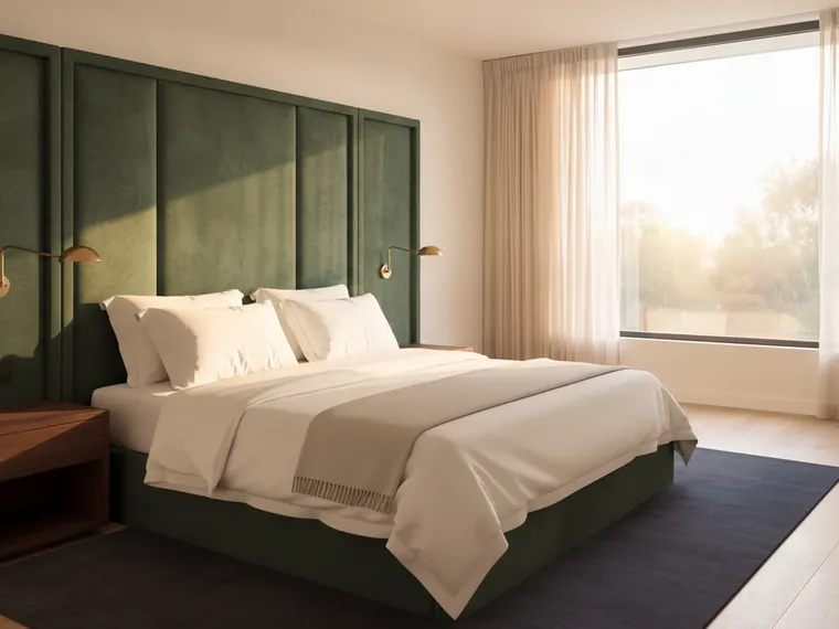
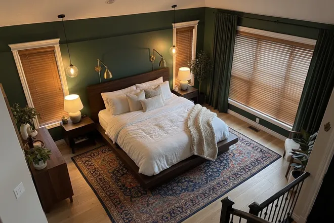
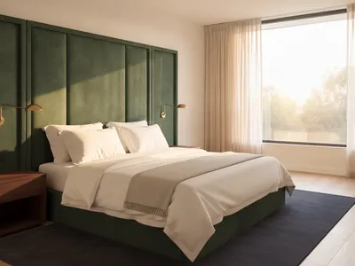
Bedroom idea: deep green velvet headboard with brass swing-arm lights

Boutique hotel green

What changed A tall deep-green velvet headboard on the blank wall, crisp white bedding, brass swing-arm reading lights, dark walnut nightstands.

Why it works The headboard height is the trick — taking it well above pillow level is what separates "hotel" from "bed against a wall". Swing-arm lights also free the nightstands entirely.

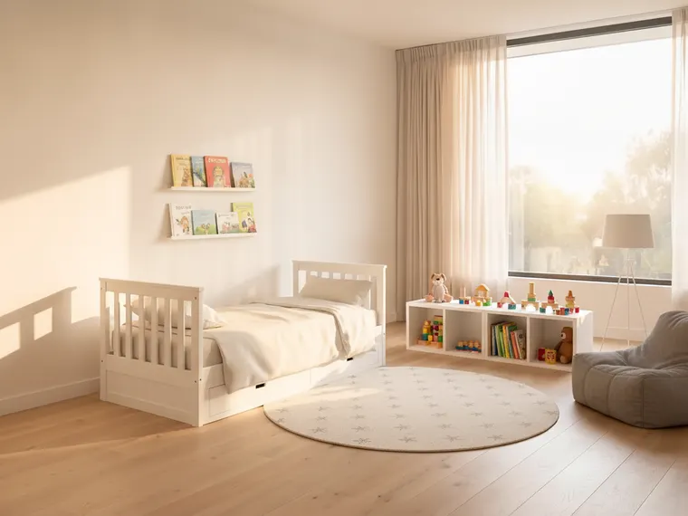
Bedroom idea: children’s bedroom with a slatted headboard and low toy shelving

A kids’ room that can grow up

What changed A white single bed with a slatted headboard, low open toy shelving, a reading nook with a bean bag and floor lamp, a round rug.

Why it works Nothing in here is themed, so it survives the child’s taste changing. The low open shelving is the only piece doing child-specific work, and it becomes book storage later.

Bedroom idea: Scandinavian bedroom in pale wood and off-white

Scandinavian, pale and plain

What changed Pale wood, off-white walls, plain linen bedding, one large soft rug and very little else.

Why it works Scandinavian is mostly restraint. The reason it photographs well and lives well is that there is nowhere for clutter to collect visually — which is also why it fails fast if you own a lot of things.

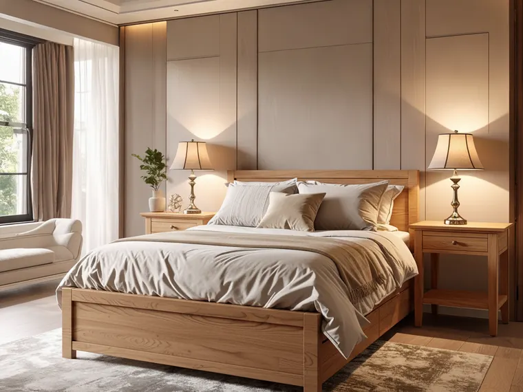
Bedroom idea: cosy modern bedroom in warm neutral tones

Cosy modern, warm neutrals

What changed Warm neutral walls, a soft upholstered bed, layered textiles, low warm lighting.

Why it works The most repeatable bedroom formula there is: one warm wall colour, one bed you actually like, and lighting below eye level. Costs least, dates slowest.

Home office

Home office and spare room ideas

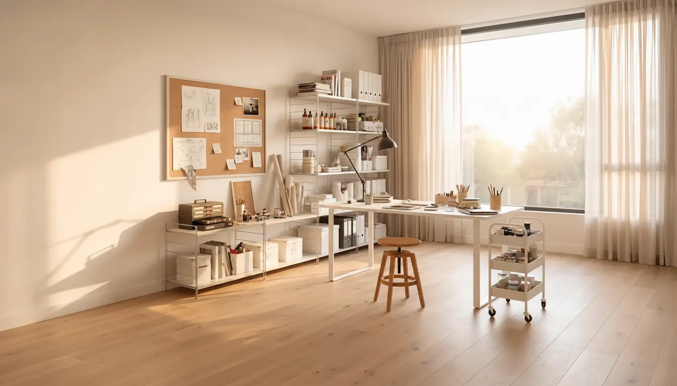
The spare room is the most argued-over room in a house: office, guest room, or both. The renders below start from the same bare room as the bedroom section above — which is the honest way to compare the options, because in real life you are choosing between them, not adding a room.

After: Maker studio
Before: The empty room
The empty room Maker studio
The same spare room that became a bedroom higher up this page. One photo, two completely different answers.
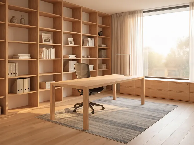
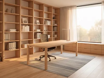
Home office idea: oak desk facing the window with floor-to-ceiling built-in shelving

A built-in study wall

What changed A wide oak desk facing the window with a mesh task chair, floor-to-ceiling built-ins along the blank wall, a slim task lamp, a low filing credenza.

Why it works Desk facing the window, storage behind you. It is the arrangement that survives video calls — your face gets the window light and the shelving is what the other person sees.

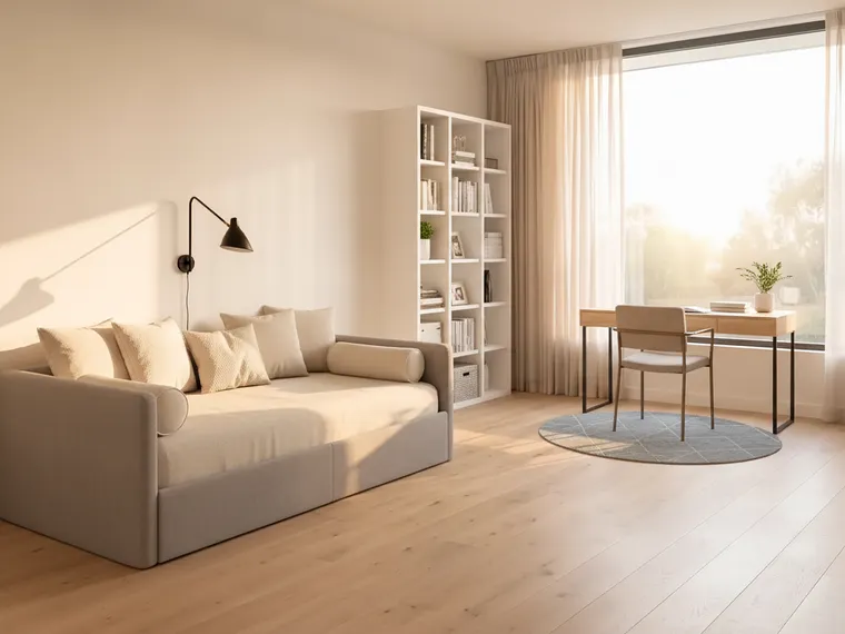
Home office idea: daybed plus a narrow desk under the window in a guest room

Office and guest room in one

What changed A compact daybed with bolsters along the blank wall, a narrow desk under the window, a tall bookcase, a wall-mounted reading light.

Why it works A daybed is the compromise that actually works, because it is furniture the other 350 days of the year. A sofa bed is not — it eats the floor whether or not anyone is staying.

Dining room

Dining room ideas

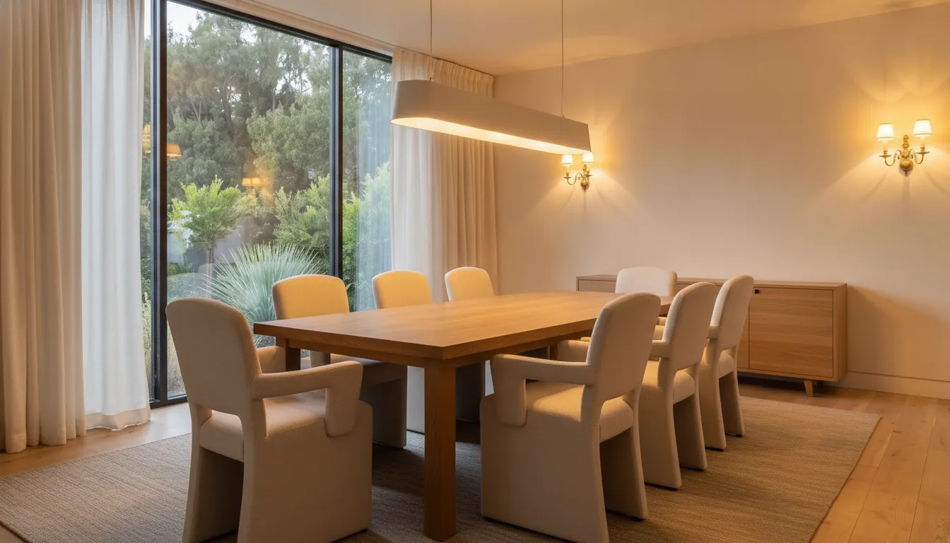
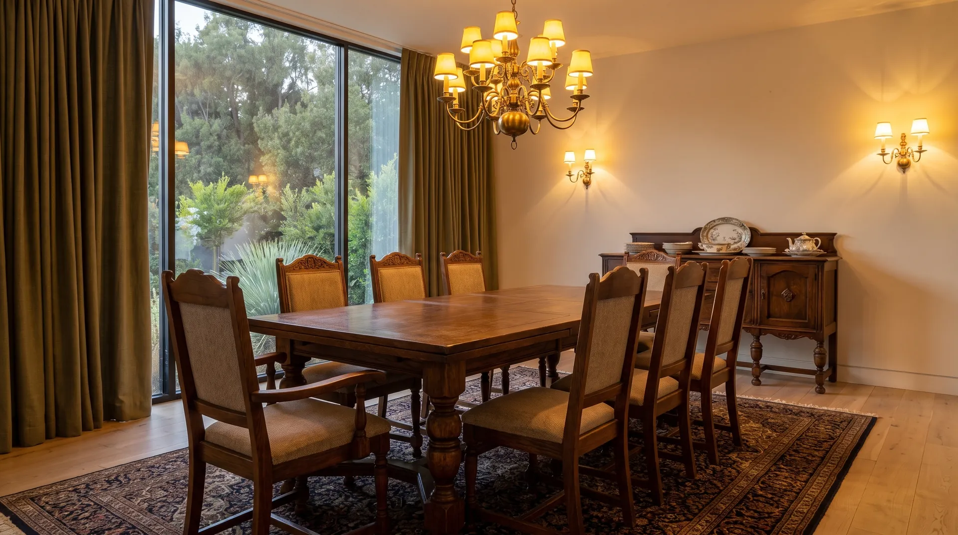
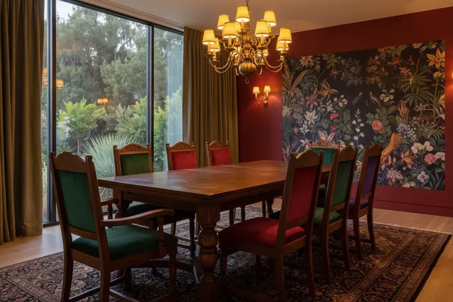
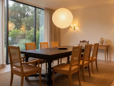
A dining room is a table, the light above it and the wall behind it. Change any one and the room reads differently, which makes it the cheapest room in the house to transform and the easiest one to get wrong. This one starts heavy: dark carved table, brass chandelier, olive curtains, patterned rug.

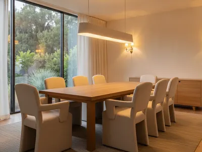
After: Warm modern
Before: The real dining room
The real dining room Warm modern
The walls, window and floor are untouched. The table, chairs, light and curtains are the whole change.
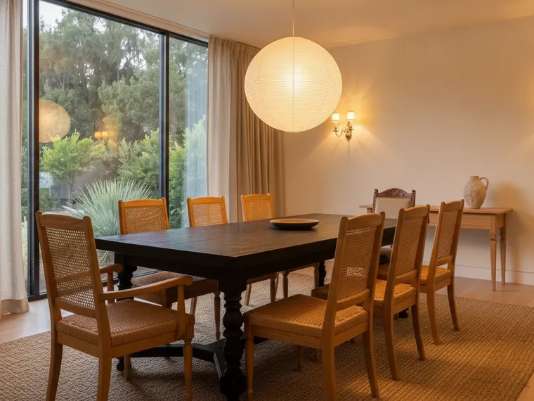
Dining room idea: Japandi with a blackened oak table and rice-paper pendant

Japandi, stripped right back

What changed Everything. The carved table, the chairs, the sideboard, the chandelier, the curtains and the rug all removed, replaced with a low blackened-oak table, paper-cord chairs, a rice-paper globe pendant and a jute rug.

Why it works Worth including precisely because it is the extreme. If you are wondering whether your dining room is heavy or just traditional, seeing it emptied out answers the question in a way a moodboard never does.

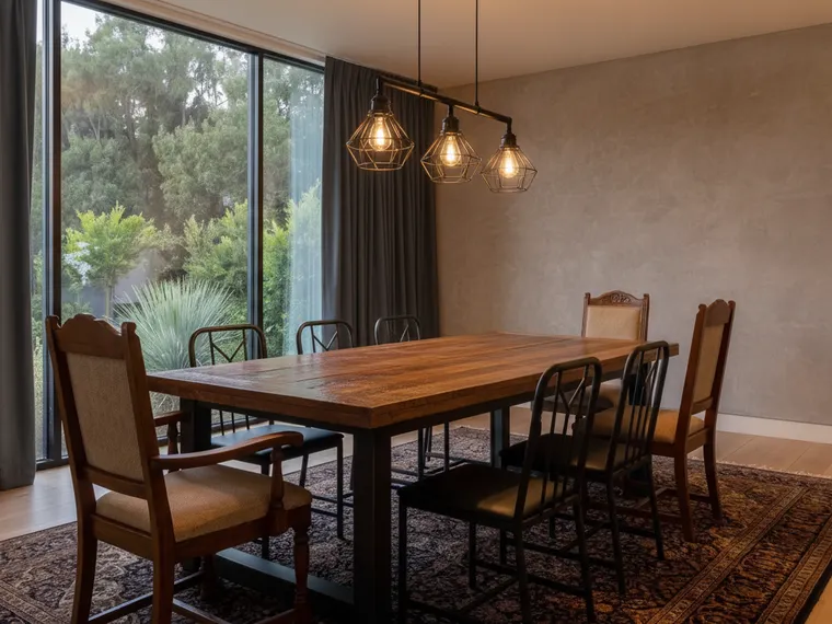
Dining room idea: industrial dining room with a heavy timber table and black metal

Industrial, keeping the weight

What changed Blackened metal, a heavy timber top, exposed bulb lighting, a darker wall.

Why it works The opposite bet to Japandi: if your room is already dark and heavy, leaning in costs far less than fighting it. Industrial is the cheapest place to land when your existing furniture is solid but dated.

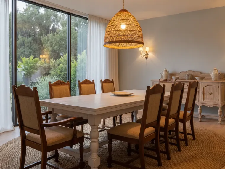
Dining room idea: coastal dining room in pale blue and white

Coastal, if the room gets real light

What changed Pale blue-grey walls, a light timber table, woven chairs, plain white linen at the window.

Why it works This only works with genuine daylight. In a north-facing dining room the same palette turns cold and grey by four in the afternoon — which is exactly the thing worth testing on your own photo before you commit paint to it.

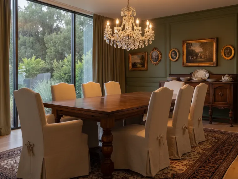
Dining room idea: sage green wall panelling with a crystal chandelier

Refined classic in sage

What changed Deep sage wall panelling, the existing dark table kept but paired with cream linen slipcovered chairs, a crystal chandelier, a large patterned rug.

Why it works The useful version for anyone who owns a good table they do not want to replace. Keeping the table and changing everything around it is a far smaller job than the render implies.

Exterior

House exterior renovation ideas

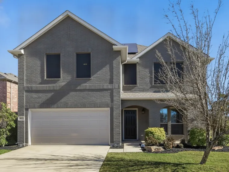
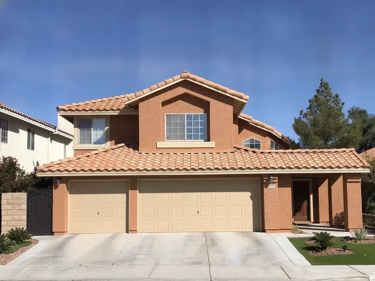
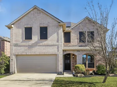
Exterior colour is the single highest-leverage renovation decision most people make, and the hardest to judge from a paint chip the size of a credit card. These are the same houses, repainted — siding, brick and stucco, each in several directions.

After: Charcoal
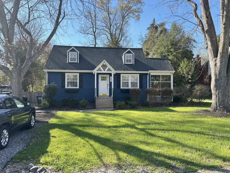
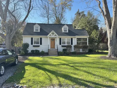
Before: The real house
The real house Charcoal
One street-view photo. The roof, windows, planting and driveway all stay exactly where they are.
Exterior renovation idea: warm white siding with black window frames

Warm white with black window frames

What changed Siding to warm white, window frames to black, front door to natural wood.

Why it works Warm white rather than pure white is what stops a repainted house looking like a rendering. The black frames are what give it edges on an overcast day.

Exterior renovation idea: deep navy siding with white trim

Deep navy

What changed Siding to deep navy, trim kept crisp white.

Why it works Navy is the safest of the dark colours because it holds its hue in shade. Charcoal and black both go flat and grey on the north face of a house; navy stays navy.

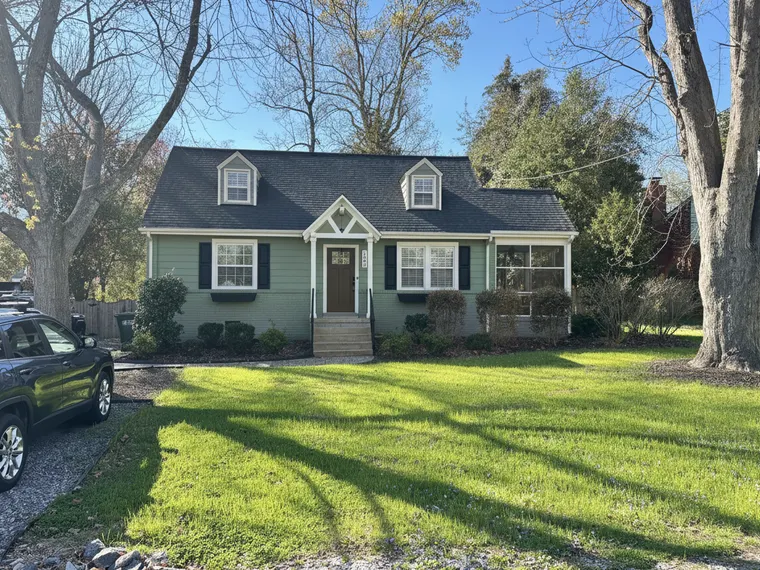
Exterior renovation idea: sage green siding with warm white trim

Sage green

What changed Siding to sage green, trim to warm white, front door to deep bronze.

Why it works Green is the colour that ties a house to its planting instead of competing with it. It also ages better than grey, which has been the default for a decade and is starting to read as such.

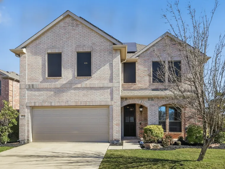
Exterior renovation idea: red brick house limewashed white

Limewashed brick

What changed Red brick limewashed to a soft off-white. Roof, windows and landscaping untouched.

Why it works The change that most surprises people. Limewash is thinner than paint and lets some brick texture through, so the house does not lose its material — it just stops shouting.

Exterior renovation idea: red brick house painted charcoal

Charcoal on brick

What changed The same brick house, painted charcoal instead.

Why it works The direct comparison is the point. Limewashed and charcoal are the two standard answers to "what do I do about this brick", and seeing both on your own house takes about twenty seconds.

Exterior renovation idea: stucco house in terracotta

Terracotta stucco

What changed Stucco to terracotta with warm white trim.

Why it works Stucco takes saturated warm colours better than siding does, because the texture breaks the surface up. The same terracotta on flat lap siding would read like a warning sign.

Yard

Yard and landscaping ideas

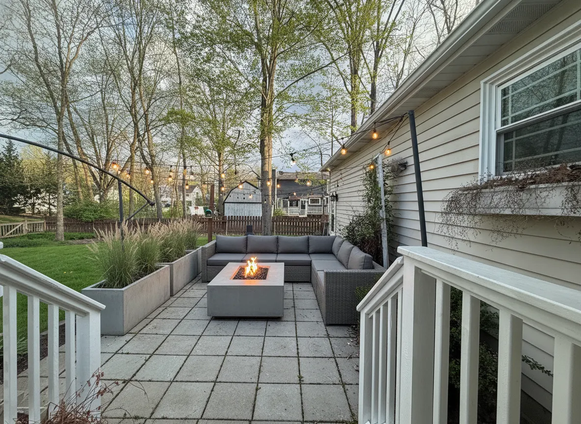
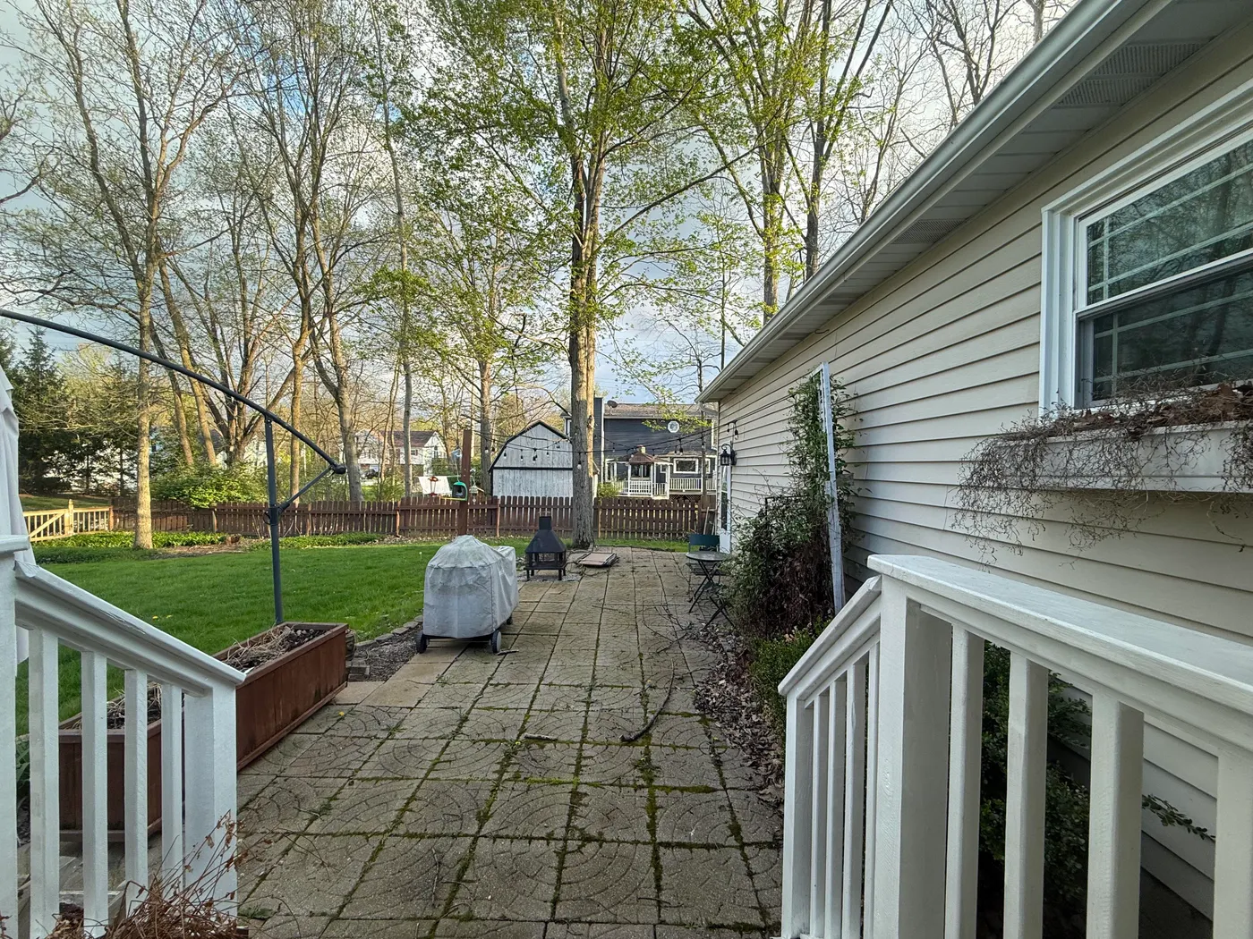
Landscaping is where a renovation budget gets spent last and noticed first. It is also the hardest thing to imagine, because the change is horizontal — you cannot hold a sample up against it. These are six directions rendered onto real yards.

After: Modern lounge
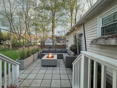
Before: The real backyard
The real backyard Modern lounge
Same fence line, same house wall, same trees. The ground plane and planting are what changed.
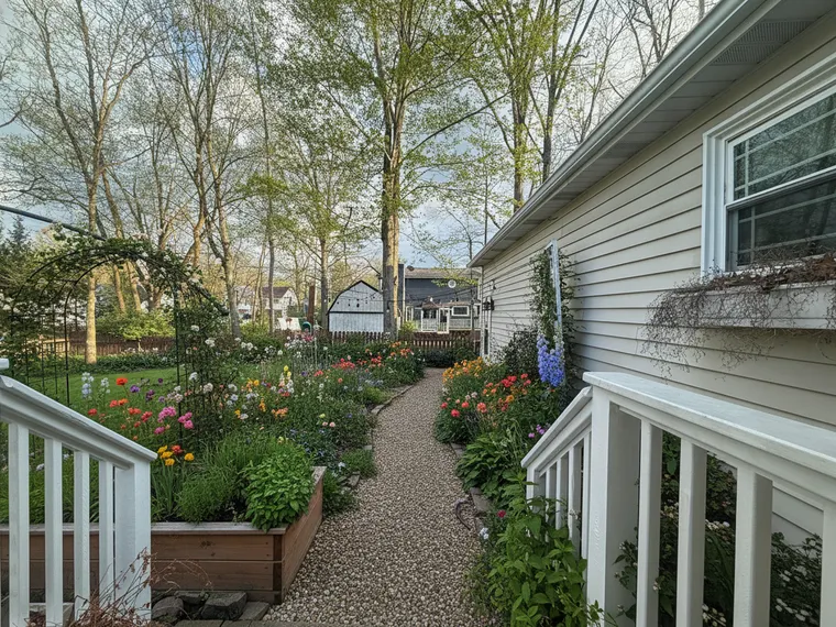
Landscaping idea: cottage garden planting in a backyard

Cottage garden in the back

What changed Deep mixed planting beds, gravel paths, informal edges instead of lawn.

Why it works Cottage planting hides an awkward yard shape better than anything else, because there is no straight line left to notice. The cost is maintenance — this is the highest-upkeep option on the page.

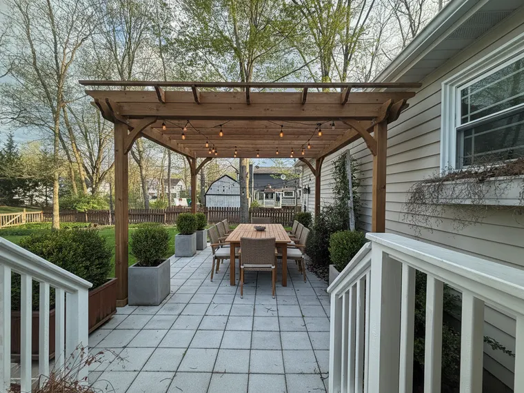
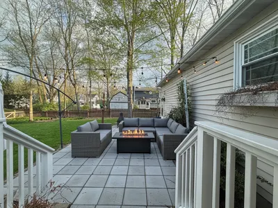
Landscaping idea: backyard dining pergola over a paved terrace

A dining pergola

What changed A timber pergola over a paved dining terrace, with climbing planting and string lighting.

Why it works A pergola is the cheapest way to make a yard feel like a room. Overhead structure does more for the sense of enclosure than any amount of fencing.

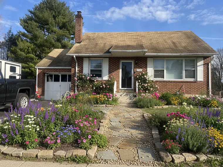
Landscaping idea: cottage garden front yard on a brick ranch

Cottage planting out front

What changed Foundation planting replaced with layered cottage beds, path edges softened.

Why it works Front-yard planting is the cheapest curb-appeal move there is, and on a low brick ranch it does more than paint. The house line stays the same; what changes is that you stop seeing the foundation.

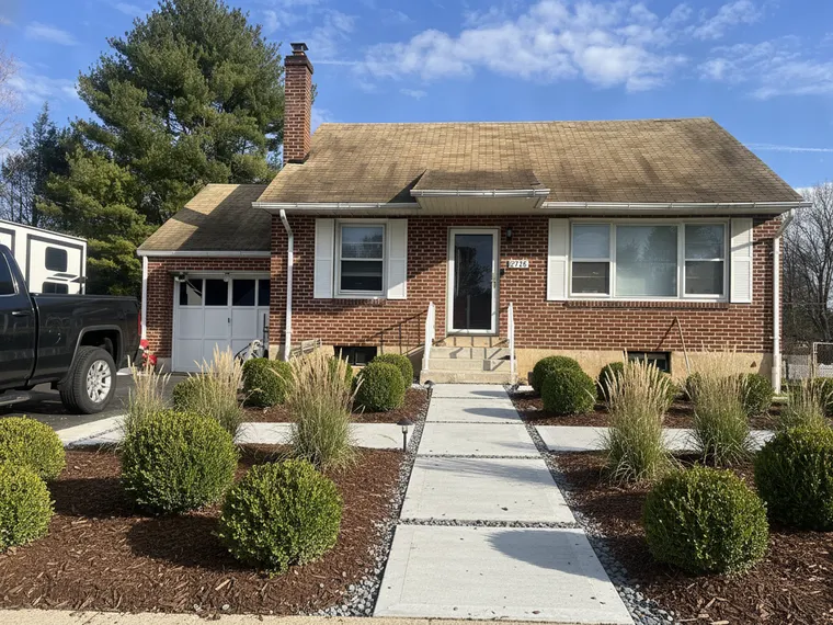
Landscaping idea: modern minimal front yard with structured planting

Modern minimal front yard

What changed Structured evergreen blocks, clean gravel or mulch fields, a single specimen tree.

Why it works The low-maintenance counterpart to the cottage version above. Same house, opposite philosophy — and worth seeing side by side before you buy two hundred plants.

Landscaping idea: lawn replaced with prairie grasses and perennials

Prairie grasses instead of lawn

What changed Lawn removed, replaced with drifts of ornamental grasses and perennials.

Why it works Lawn replacement is the renovation that saves money after it is done. Grasses also read as intentional in a way a struggling lawn never does.

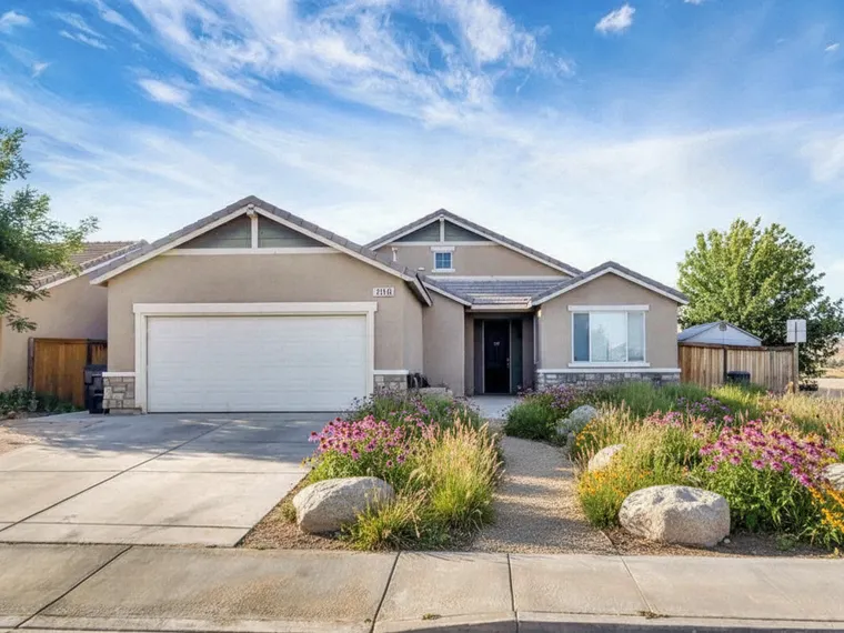
Landscaping idea: xeriscape yard with gravel and drought-tolerant planting

Xeriscape

What changed Gravel and decomposed granite ground plane, drought-tolerant planting, boulders as structure.

Why it works The right answer in a hot dry climate and the wrong one almost everywhere else. If you are in the west, this is the version worth pricing.

Driveway

Driveway, patio and walkway ideas

Hardscape is the part of a renovation nobody photographs and everybody walks on. It is also expensive enough per square foot that guessing the material is a costly way to find out you dislike it. Six surfaces, rendered onto real driveways, patios and paths.

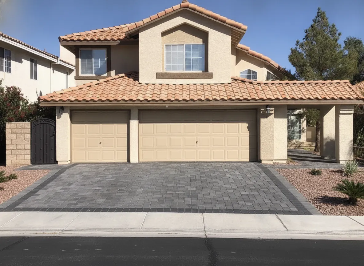
After: Concrete pavers
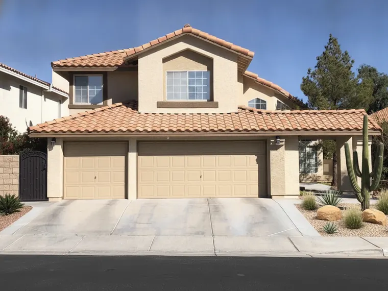
Before: The real driveway
The real driveway Concrete pavers
The house, the garage doors and the planting are untouched. Only the ground surface changed.
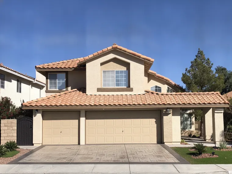
Driveway idea: stamped concrete driveway

Stamped concrete

What changed The driveway surface to stamped concrete in a warm grey.

Why it works Cheaper per square foot than pavers and it reads similar from the street. The honest trade is repair: a cracked slab is a patch, where a cracked paver is one unit lifted out.

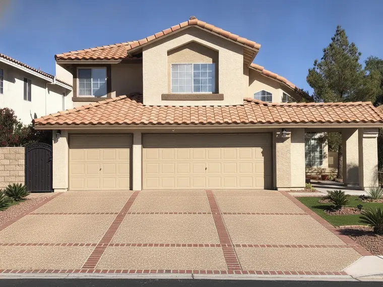
Driveway idea: exposed aggregate concrete driveway

Exposed aggregate

What changed The driveway to exposed aggregate.

Why it works The one that ages best. Texture hides staining, tyre marks and the general reality of a driveway far better than a smooth finish does.

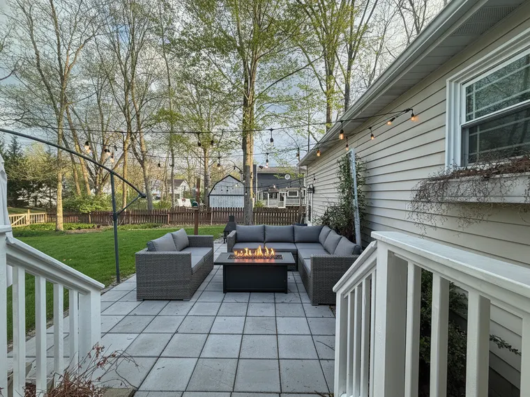
Patio idea: large-format porcelain pavers

Porcelain pavers on a patio

What changed The patio surface to large-format porcelain pavers.

Why it works Large format makes a small patio read bigger — fewer joints, less visual noise. Porcelain also does not take up moss the way natural stone does in shade.

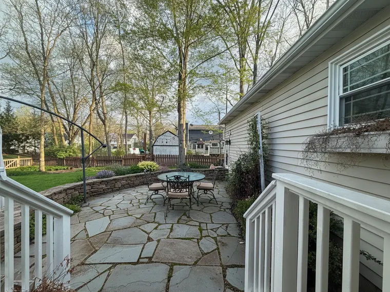
Patio idea: bluestone flagstone patio

Bluestone flagstone

What changed The same patio in irregular bluestone flagstone.

Why it works The traditional counterpart to the porcelain above, on the same patio. Bluestone reads warmer and less new — which is the point if the house is not modern.

Walkway idea: brick herringbone path

Brick herringbone walkway

What changed The front walkway to brick laid in herringbone.

Why it works Herringbone is worth the extra labour on a path specifically: the diagonal pattern makes a narrow walk feel wider than a running bond does.

Entry path idea: brick path edged with boxwood

Brick path with boxwood

What changed The entry path to brick, edged with clipped boxwood.

Why it works The edge does as much as the surface. A hard green line along a path is what makes an entry read finished rather than merely paved.

By style

Home design styles, in real rooms

The other way people look for ideas: not “what do I do with my dining room” but “what does Japandi actually look like once it is in a room with my ceiling height”. Ten styles, one render each, and the one line that is genuinely the difference between them.

Mid-century modern living room render

Mid-century modern

Low walnut furniture, tapered legs, one saturated accent colour, and floor left visible under everything.

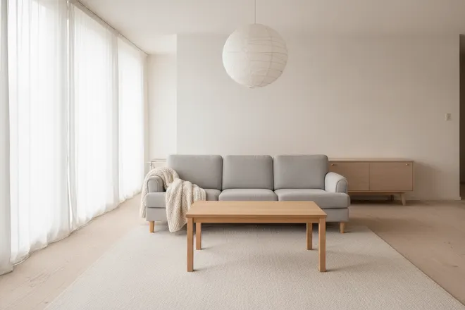
Japandi living room render

Japandi

Scandinavian restraint with Japanese proportion — low, warm, almost empty, and no shiny surfaces anywhere.

Scandinavian living room render

Scandinavian

Pale wood, off-white walls, plain textiles. The style with the least in it, which is why it needs storage elsewhere.

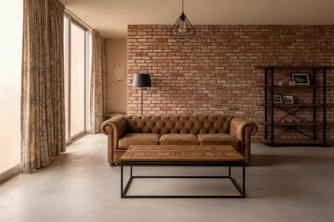
Industrial living room render

Industrial

Blackened metal, worn leather, exposed structure and hard materials. Forgiving of an existing dark room.

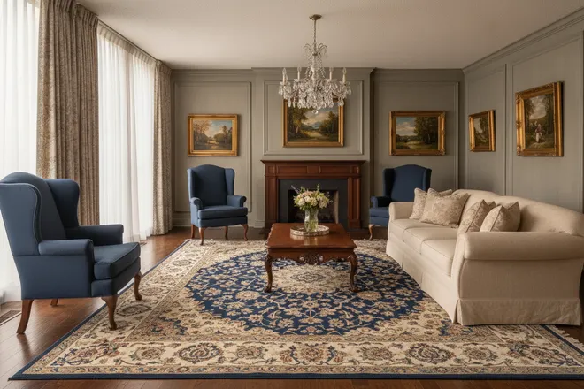
Traditional living room render

Traditional

Symmetry, deep colour, framed art hung in pairs, and furniture with visible upholstery detail.

Coastal living room render

Coastal

Pale blue-grey, slipcovers, natural fibre rugs. Needs real daylight or it turns grey.

Maximalist dining room render

Maximalist

Pattern on pattern, deep saturated walls, and more objects than a rule would allow. Hardest to pull off, most personal when it lands.

Boutique hotel bedroom render

Boutique hotel

A tall upholstered headboard, layered white bedding, wall-mounted reading lights, and nothing on the floor.

Moody green bedroom render

Moody green

One deep colour taken over walls and trim together, so the room loses its edges and reads as a single volume.

Warm minimalist living room render with a boucle sofa and travertine table

Warm minimal

Few pieces, warm materials, and textures that disagree with each other — boucle against stone against linen.

Any of these can be applied to a room you photograph by naming it in the sentence — AI Interior Design is built for exactly that, and AI Room Design is the room-led version if you would rather describe the outcome than name a style. The renovation tools guides walk through both.

By how far you go

The same room at three levels of work

“Renovation ideas” covers everything from a Saturday with a paint roller to a permit and a skip. These three renders are the same dated bathroom at three scopes — same room, so the comparison means something.

Bathroom refreshed with paint and fittings only 1 of 3

Paint and fittings only

Wall colour, hardware, mirror, lighting and textiles. The tile, tub, vanity carcass and floor all stay. A weekend, and reversible.

Will not fix a bad layout or failing tile — it makes a sound room look current.

Bathroom with new tile, vanity and fixtures over the existing layout 2 of 3

New surfaces

New tile, vanity, fixtures and shower screen, over the existing layout and plumbing positions. The version most people actually mean by "remodel".

Trades stay short because nothing moves. Costs jump the moment a drain does.

Bathroom fully gutted and rebuilt with a new layout 3 of 3

Full gut

Back to studs, layout free to change, plumbing and electrical repositioned. Everything in the room is a new decision.

The only tier that fixes a layout, and the only one that needs a permit conversation.

The step nobody skips and everybody regrets skipping is deciding which tier you are in before you start shopping. Seeing all three on your own room takes under a minute in AI Bathroom Design, and the same logic applies to a kitchen — the DIY kitchen remodel guide works through where the cost steps actually are.

Turning an idea into a decision

Three steps, about a minute

An idea you have only seen in somebody else’s house is a wish. An idea you have seen in your own room is a decision. The gap between the two is one photo and one sentence.

1

Photograph the room as it is

One shot from the doorway, in daylight, wide enough to catch two walls. Do not tidy first — the render will replace what you asked it to replace, and a realistic before makes the after easier to trust.

2

Steal a sentence from this page

Every idea above is a description, not a preset. "Repaint this house exterior sage green with warm white trim and a deep bronze front door" is a sentence you can type as-is. Change one word to make it yours.

3

Run three, not one

The value is in the comparison. Three renders of the same room takes about a minute and tells you more about your own taste than a month of scrolling, because you are finally judging your room instead of somebody else’s.

Start with AI Home Remodel if you want to change the fabric of a room — cabinets, tile, countertops, siding. Start with AI Room Design if the walls are fine and it is the furniture and colour you are unsure about.

Questions

Renovation ideas, answered honestly

Where should I start with a home renovation?

Start with the room that annoys you daily, not the one with the best resale story — you will live in the decision far longer than you will sell it. Then photograph it and try three directions before you price anything. Most people discover their second or third idea is the one they actually want, and finding that out costs nothing at the render stage and a great deal at the demolition stage.

What are the highest-impact home renovation ideas?

In rough order of change-per-dollar: exterior paint, cabinet colour, front door, landscaping and planting, backsplash, and lighting. Every one of those alters how a house reads without moving a wall or a drain. The examples on this page are deliberately weighted towards them — the sage green cabinets, the limewashed brick and the front-yard planting are all in that band.

Can I see these renovation ideas on my own house?

Yes, and that is the point of the page rather than a footnote to it. Every idea here was made by photographing a real room, typing a sentence describing the change, and getting a render back in about ten seconds. You can run the same sentence on your own photo — the tool link under each section carries the idea straight through.

Is it free to try renovation ideas on a photo?

Yes. New accounts get free credits with no card, and the free tier stays available afterwards. Pro unlocks higher volume, higher-resolution downloads and unwatermarked exports. Every render on this page came off the same engine the free tier uses.

Which rooms change the most for the least money?

Bathrooms and small bedrooms, because the surface area is small and the whole room is in one field of view. Kitchens change the most in absolute terms but the cost scales with cabinetry, so the high-leverage kitchen ideas are the ones that keep the boxes — colour, hardware and backsplash. Exteriors are the outlier: the cheapest square-foot change in the house and the one everybody sees.

How do I choose between two ideas I like?

Render both on the same photo and look at them the next morning. Comparing two images of your own room settles arguments that comparing two Pinterest boards never will, because the light, the ceiling height and the awkward corner are the same in both. If they still tie, pick the one that needs less work — you can add later, you cannot un-tile.

Do I need measurements, a floor plan or a 3D model?

No. One photo taken from a doorway is the entire input for everything on this page. Nothing was measured, modelled or drawn. What that also means is that a render will not confirm a sofa physically fits — measure before you buy furniture, and treat the image as a decision about look, not about fit.

Are these ideas realistic to actually build?

The finish-level ideas are: paint, tile, cabinet colour, countertops, fixtures, planting and paving are all ordinary work that ordinary trades do. Where you have to be careful is anything that implies a layout change — the Japandi dining room above is a furniture swap, but a render that moves a shower drain or a window is describing a much larger job than it looks. Bring the render to a contractor as a brief, not as a drawing.

Keep browsing

Everything else on the site

Try it on your own photo

Guides by room

Popular walkthroughs

Now try one on your own house

Pick the idea you kept scrolling back to, photograph the room, and type the sentence. You will have it rendered into your own space in about ten seconds — free, on iPhone, Android and the web.