

 Your photo
 1Photograph the cabinets
One photo from the doorway, with the counters and backsplash in frame. A phone snap is enough — no measuring, no floor plan, and the clutter on the counter does not matter.
Free to try
Upload one photo of your kitchen and see your cabinets in a new color in seconds — sage, navy, creamy white, charcoal, or a brand color you name. Your counters, backsplash and floor stay exactly as they are, so you are judging the color on your own kitchen instead of somebody else’s.
No account for your first render · takes seconds · nothing to mask or select
Try a color
The same color behaves differently on espresso doors than on builder-grade oak, which is the entire reason a chip cannot answer this. Pick a kitchen, pick a color, and watch the real render wipe in over the original photo. Every prompt below is the sentence that produced that image.
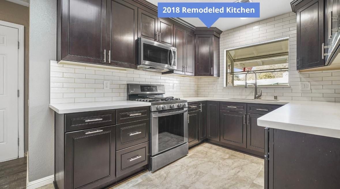
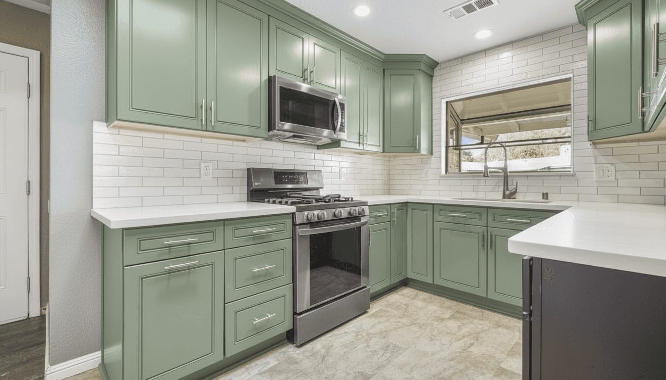 Before Sage green rendered in 10s
 Dark espresso doors, white subway tile, quartz counters. Everything except the cabinet colour was held.
These three changed the counters and backsplash as well as the doors — what a cabinet colour looks like when the surfaces around it move too.
Paint the dark espresso cabinets sage green. Keep the white subway tile backsplash and quartz countertops
Six renders, two photos, no repainting. If you would rather read the decision through before you run it, the full cabinet color walkthrough goes surface by surface, and how to choose kitchen cabinet colors covers picking the shortlist in the first place.
How it works
No masking, no tapping each door, no 3D model, no showroom appointment. The photo you can take from the kitchen doorway right now is the input.
Your photo One photo from the doorway, with the counters and backsplash in frame. A phone snap is enough — no measuring, no floor plan, and the clutter on the counter does not matter.
Paint the dark espresso cabinets sage green. Keep the white subway tile backsplash and quartz countertops
Type it the way you would say it to a painter. Name a brand colour or just say "sage green with brushed brass" — and say what stays, because everything you do not mention is held.
10s The render A photorealistic render of your own kitchen in that colour, in seconds. Keep it, change the hardware, or run three more colours on the same photo and line them up.
The dark-cabinet renders on this page came back in about ten seconds each. Three colors on the same kitchen photo and you have a shortlist before the paint store closes.
Light, dark, warm, cool
Cabinet doors are the biggest color block in a kitchen, so the choice is doing two jobs at once: it sets the style, and it changes how large and how bright the room reads. In a small kitchen the second job is the one that matters, and it is the one a swatch grid cannot show you. All three below are the same kitchen, so the only variable is the color — which is exactly the comparison you want and exactly the one you cannot make in a store.
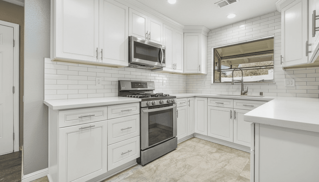 Bright white on espresso
 Light doors bounce whatever light the room already has, which is why every small-kitchen article ends at white. What they leave out: white is the least forgiving finish in a working kitchen, and it makes every warm surface you kept — beige granite, oak floor, cream tile — read warmer by comparison. Look at the counters in the render, not the doors.
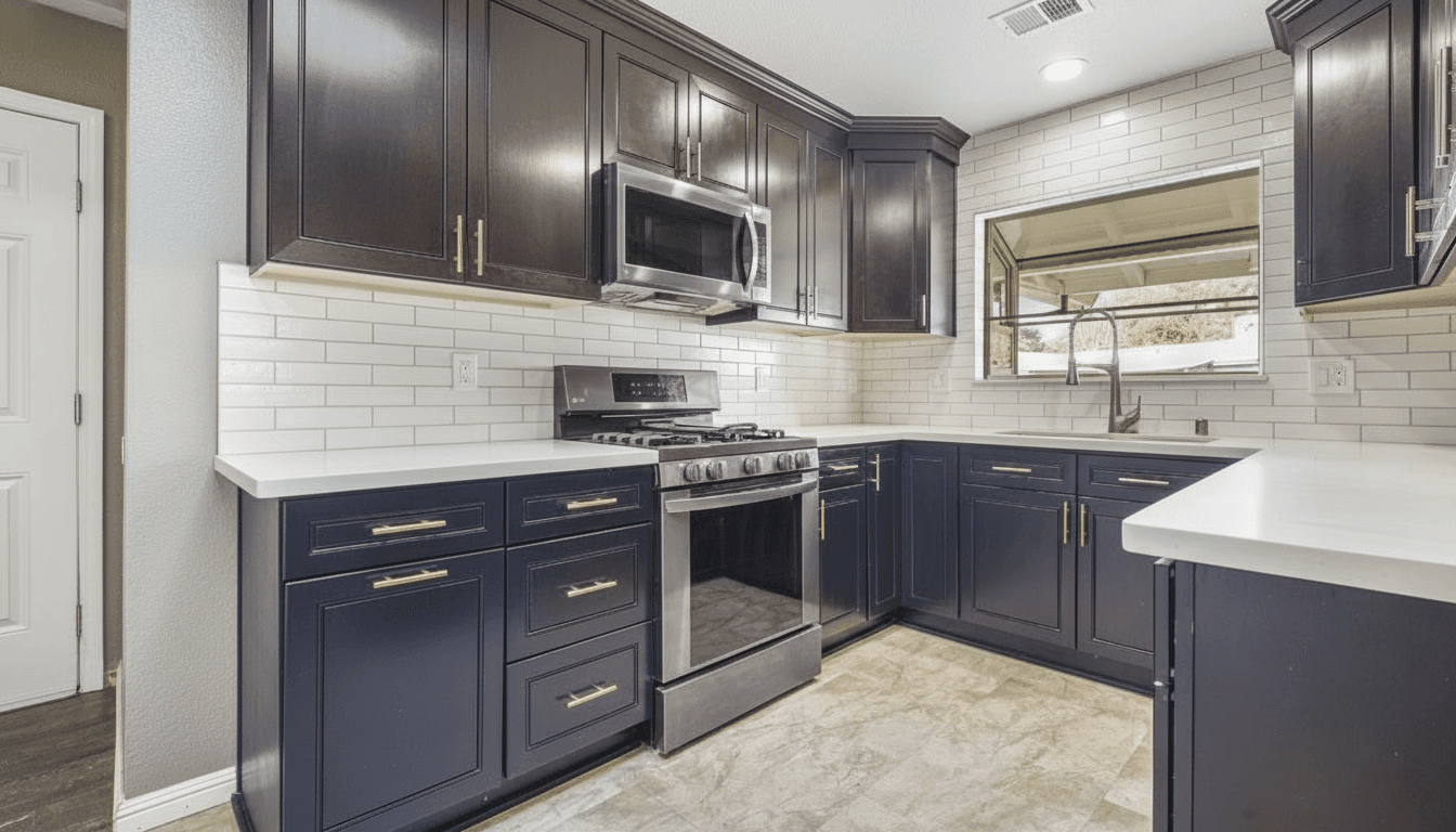 Deep navy on espresso
 A saturated dark does not shrink a kitchen the way people fear — it lowers the contrast between the doors and the shadows, so the run stops reading as a wall of cabinets. It also hides ten years of shoes, chair legs and dishwasher steam. The risk is the opposite of white: dark doors flatten a room with no other source of light.
Sage green on espresso Almost every cabinet-colour regret is an undertone mistake, not a hue mistake. A greige with a pink lean next to a granite with a green lean is a fight you look at every morning. In a photo of your own kitchen the lean is obvious in a way it never is on a two-inch chip held up under store lighting.
Every article about small kitchens lands on the same advice — go light, go glossy, go handleless — and it is not wrong so much as incomplete. What makes a small kitchen feel bigger is fewer visual breaks, not more brightness. One color from floor to ceiling, uppers and lowers the same, with the counter close in value to the doors, does more than a whiter white does. That is a hard thing to believe from a paint chip and an obvious thing to see in a render of your own galley.
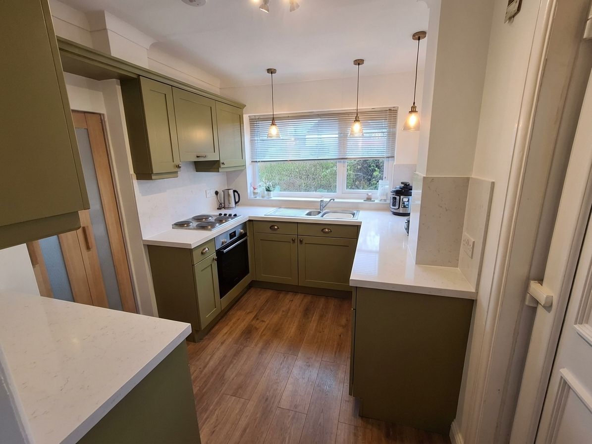
This one is the case in point: a real galley kitchen with beech frames, blue-grey door fronts, a wood-effect worktop, a beige tiled splashback and green walls — five surfaces, five temperatures, in a room barely wide enough to open the oven. The olive version is not lighter than what it replaced. It is quieter, and the room reads bigger for it. Be straight about what else moved in that render: the worktop, the floor and the lighting changed too, so read it as a direction rather than a paint-only preview.
Small kitchen, big style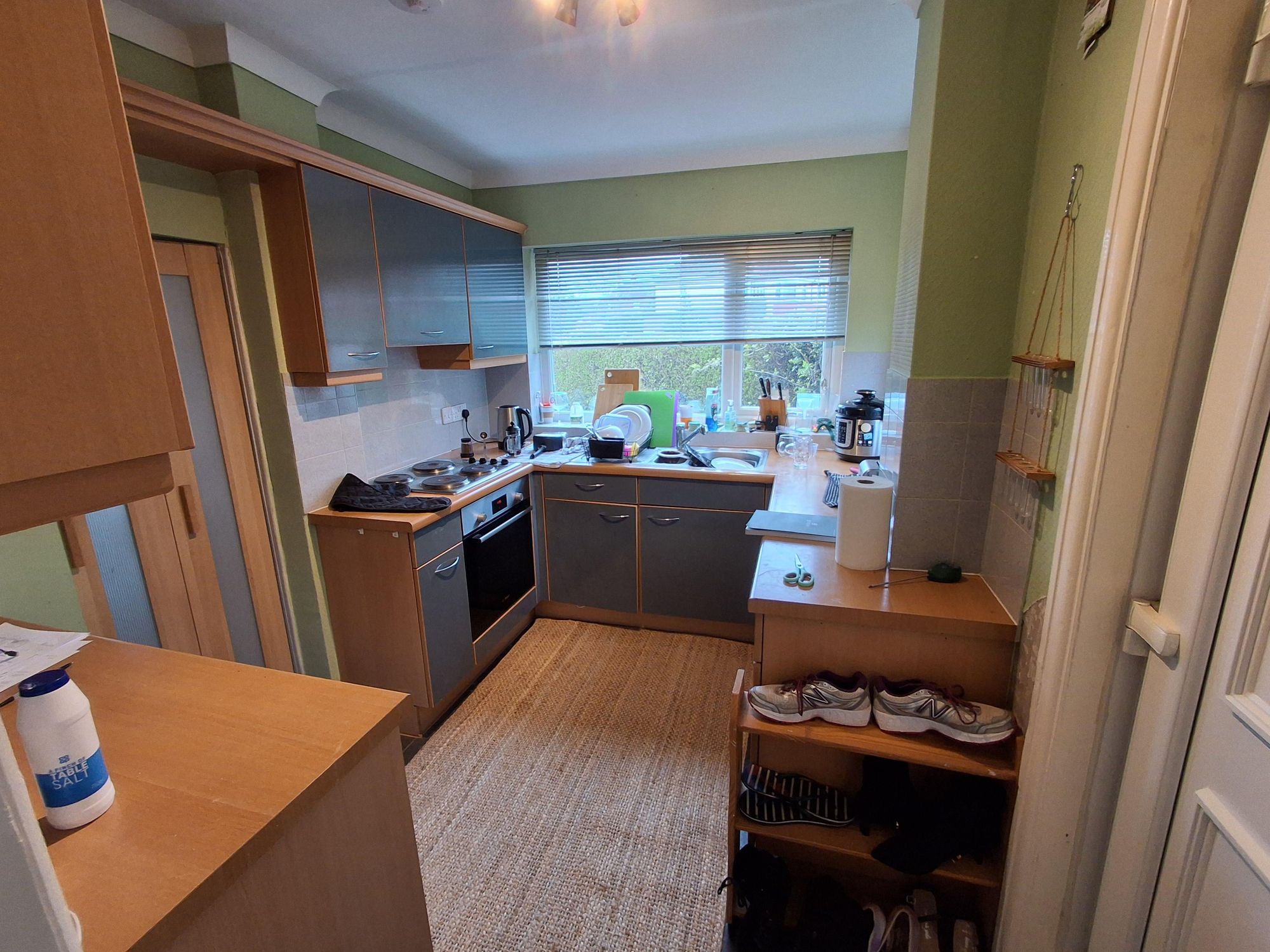
The question we get most
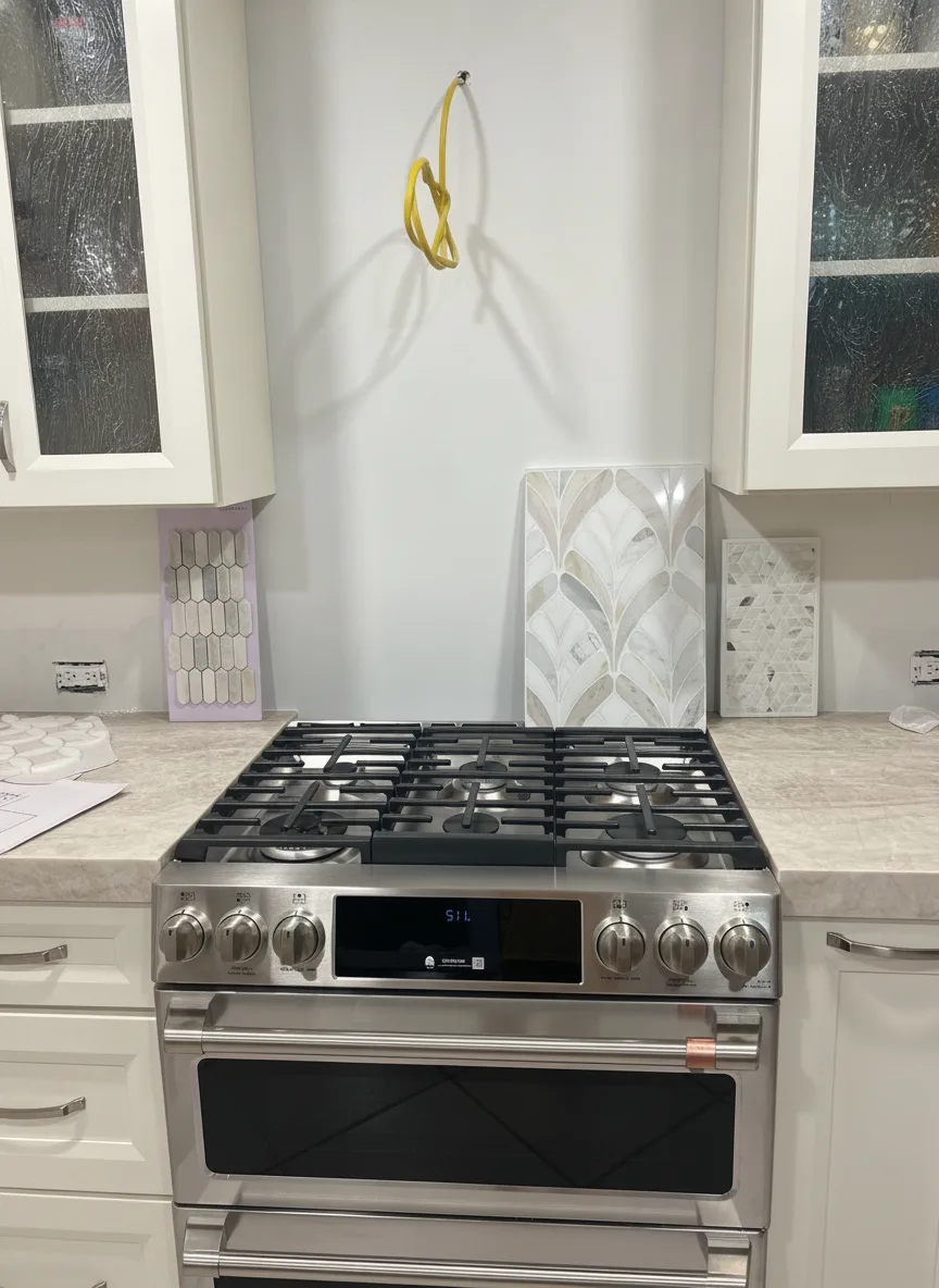
Dark cabinets going light is the easy case. The harder question is the opposite one: my cabinets are honey oak, can I see those in a different color? We ran it on a real homeowner photo taken mid-project — bare backsplash wall, tile samples still propped against it, no color chosen yet.
 Creamy white
 “Paint the honey oak cabinets a creamy warm white. Keep the stainless range, the cream stone countertops and the tile samples propped against the wall exactly as they are.”
White is what most people picture when they say “update the oak”. Notice what it costs: the cream counters now read as the warmest thing in the frame. If your counters lean beige, white doors push them yellower, not cleaner.
Try this on your kitchen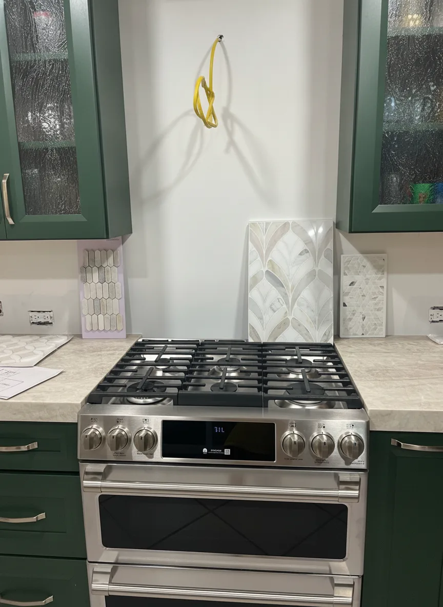 Deep forest green
 “Paint the honey oak cabinets a deep forest green with brushed brass hardware. Keep the stainless range and the cream stone countertops exactly as they are.”
Green does the opposite of white: it makes the cream counters read as light and deliberate instead of dated. This is where a preview earns its keep, because almost nobody can picture a dark saturated colour in their own kitchen from a chip.
Try this on your kitchen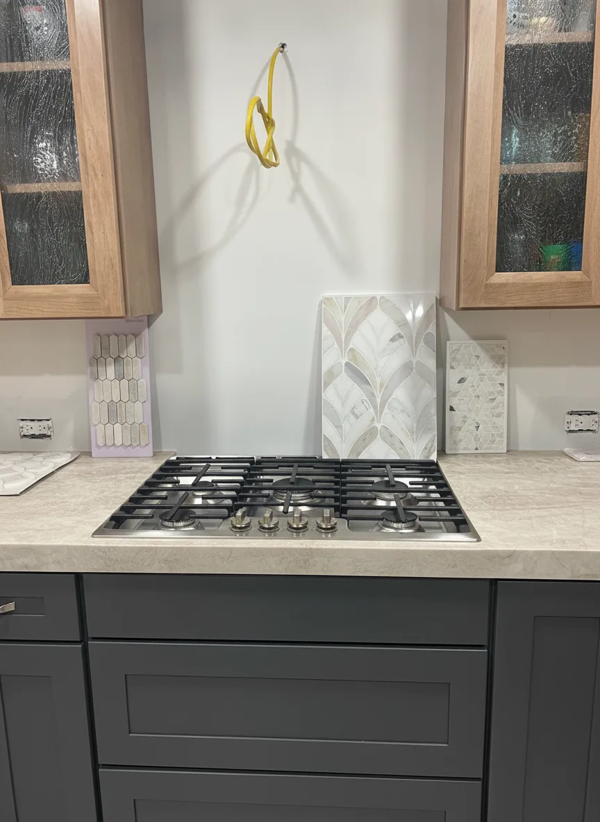 Two-tone charcoal
 “Paint only the lower oak cabinets deep charcoal and leave the upper glass-front cabinets in natural oak. Keep the stainless range and the cream stone countertops exactly as they are.”
Two-tone runs one direction: darker below, lighter above. Lowers sit where the floor sits, so dark down there reads as ground; uppers live at eye level, so light up top keeps the room open. It is the answer for people who like their oak but not all of it.
Try this on your kitchenWorth knowing before you read your own render: look closely at the two-tone version and the double-oven range from the original came back as a cooktop with drawers under it. Nobody asked for that. The color is real; the inventory is not. Trust the hue and the way the room’s light changes, verify the appliances and the hardware, and never hand a render to a contractor as a spec.
Against what stays
Almost nobody replaces everything. The counters, the backsplash, the floor and the appliances usually stay, and the cabinet color has to answer to them. This is where most regret comes from — not from picking a bad color, but from picking a good color that fights the one surface nobody is touching.
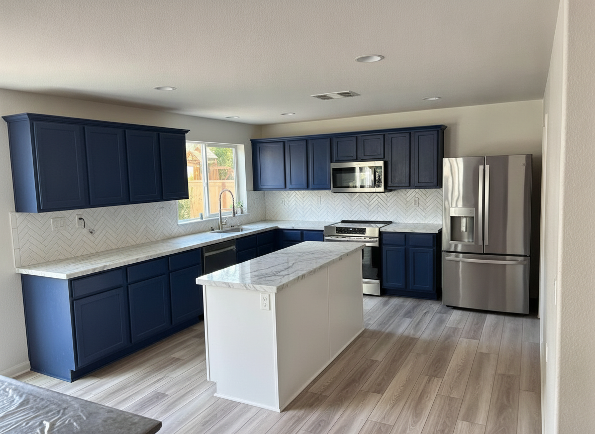
The counter is usually the loudest surface in the room and the one you are least likely to replace, so the cabinet colour reports to it — not the other way round. Heavy granite movement wants one calm colour everywhere; a quiet quartz will carry a two-tone kitchen.
Name your anchor first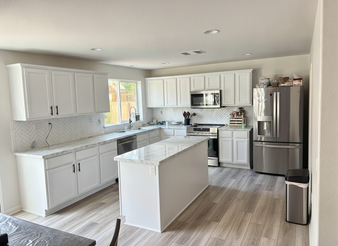
Plain white subway tile is the quietest backsplash there is, which is exactly why a muted sage can sit against it and read deliberate. Put that same sage against a veined marble mosaic and it becomes clutter. If the tile is staying, render the cabinets against it — not against a white wall.
Backsplash colours against cream cabinetsCabinets do not have to match the floor. They have to share an undertone with it, which is a different test. A warm oak floor will carry sage, greige, navy or cream — what it will not carry is a colour that pulls icy cool against the wood.
Decide a kitchen in the right order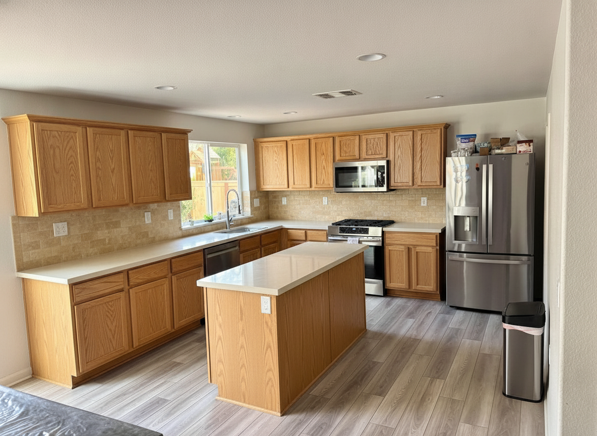
Hardware is the cheapest change in the kitchen and it sets the whole temperature. Brushed brass against a warm cabinet works here because it is the only metal in the frame. Add a second finish and it stops being an accent. Name the hardware in the same sentence as the colour and see them together.
Change the rest of the kitchen too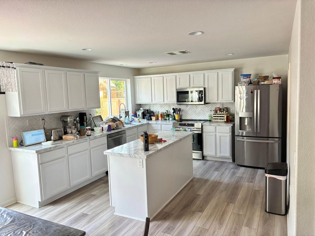
Stainless is neutral and forgives everything. Black or panel-ready appliances are a second colour block, and a dark cabinet colour next to a black range needs a reason to be there. Keep the appliances in the frame when you photograph the kitchen so the render has to answer for them.
A full cabinet colour walkthroughNorth-facing kitchens pull colours cooler and dimmer; a south window flatters almost anything. This is the reason a colour that looked right in the showroom lands wrong at home — and the reason to photograph your own kitchen at the hour you actually cook in it rather than at noon.
See the rest of the house remodelledThe shortcut: rank your anchors, name the loudest one’s undertone, then only look at colors that share it. A render of your own kitchen collapses all three steps into one picture — the clash is either there or it isn’t.
Before you decide
A color visualizer answers one of these two questions well and the other one only partly. Worth knowing which question you are actually asking before you spend an afternoon rendering colors.
The boxes stay, the layout stays, the footprint stays. You are changing one variable — colour — which is exactly the change a visualizer can show you honestly, because everything else in the photo is meant to stay put.
New boxes let you move the run, change the door style, raise the uppers or delete them. That is a layout project with a colour decision attached, and a render will show you the look but cannot see your plumbing or your load-bearing wall.
If the layout is fine and the doors are just the wrong color, you are in the first column and a render settles it. If you are moving the run or deleting the uppers, start at AI kitchen design instead — same engine, wider change — and treat the color as the last decision rather than the first.
Straight answers
A cabinet color render is a shortlisting tool. It answers “would I like my kitchen that color?” in seconds, for free, before anyone opens a can.
Questions
A tool that shows you cabinets in a colour before anyone buys paint. The older ones hand you a template kitchen to recolour, which tells you what a colour looks like on somebody else’s doors, under somebody else’s light, next to somebody else’s counters. This one repaints the photo you took of your own kitchen — the counters, the backsplash, the floor and the window all stay exactly where they are, and the only thing that moves is the cabinet colour.
Your first render does not need an account, and new accounts get free credits after that with no card. Pro adds volume, higher-resolution downloads and unwatermarked exports — the renders themselves come off the same engine either way. Every before and after on this page was produced on it.
That is the whole job, and it is the box at the top of this page. Add a photo, type the colour the way you would say it out loud, and the repainted kitchen comes back in seconds. Run three colours on the same photo and compare them side by side instead of one at a time from memory.
You can name it in the sentence and it will render its approximation — “Benjamin Moore Hale Navy cabinets with brushed gold hardware” behaves the same way “deep navy with brushed gold” does. Be clear about what that is: we have no partnership with any paint company and this is not an official colour match against a fandeck. Use it to shortlist two or three, then hold real samples against the doors in your own kitchen light.
Yes, and oak is the case worth testing before you commit, because oak going light behaves differently from dark going light. The honey oak tab above is one real mid-project kitchen painted three ways. One thing a render will not tell you: oak has deep open grain, and painted oak still reads as oak in person unless someone fills that grain first. The render gives you a smoother door than a painter will.
Accurate enough to decide with, not accurate enough to order from. The render keeps your kitchen — cabinet runs, window, ceiling height and camera angle stay put — so you are judging the colour and not a different room. Trust the hue, the value and the way the room’s light shifts. Do not assume the inventory came back untouched: in one published render a double-oven range came back as a cooktop with drawers under it, and nobody asked for that.
No. There is nothing to trace, mask or tap. You upload the photo and type the change — the model works out which surface is a cabinet door, which is counter and which is backsplash, and leaves everything you did not mention alone.
Yes — say so. “Paint only the lower cabinets deep charcoal and leave the uppers in natural oak” is a normal sentence for it, and the two-tone example above is exactly that prompt. Naming the part you want changed is more reliable than naming the part you want kept.
Renovate AI runs on iPhone and Android as well as in the browser, so you can stand in the kitchen, photograph it and repaint it on the spot. The same account and the same renders follow you across every device. If you are on a phone right now, the box at the top of this page works without installing anything.
Seconds. The dark-cabinet renders on this page came back in about ten seconds each, and the whole-kitchen set in seven to nine. Long enough to read the prompt back, short enough to try a second colour before you have put the phone down.
Yes, and that is the point of using your own photo rather than a template. The counters, backsplash and floor in the render are the ones in your kitchen, so the undertone clash — or the lack of one — is visible immediately. Say “keep the countertops and backsplash exactly as they are” in the sentence and it will hold them.
Yes. A vanity, a laundry run, a mudroom bench and a built-in bookcase are all cabinet doors as far as the model is concerned. Photograph it, name the colour, say what stays.
Keep going
Counters, backsplash, hardware, layout — the whole kitchen from the same photo, not just the doors.
Design the kitchenThe same idea pointed at the street view — siding, brick, stucco, trim and the front door, repainted from one photo.
Paint the houseKitchens, bathrooms, living rooms and bedrooms remodelled from a photo, with a rough cost range beside each render.
Remodel a roomThe long read behind this tool — two real kitchens, six colors, and the failure modes worth knowing before you commit.
Read the walkthroughOne photo from the kitchen doorway, one sentence, and your cabinets come back painted in seconds. Free to try — on iPhone, Android and the web.


