White Subway Tile with Cherry Cabinets: How to Tell It's Working Before the Grout Dries
There’s a moment in every backsplash install where the kitchen looks worse than when you started. The tile is up but the grout is half-done. The lines look crooked. The whole thing reads as a mess, and you start wondering if you picked the wrong tile.
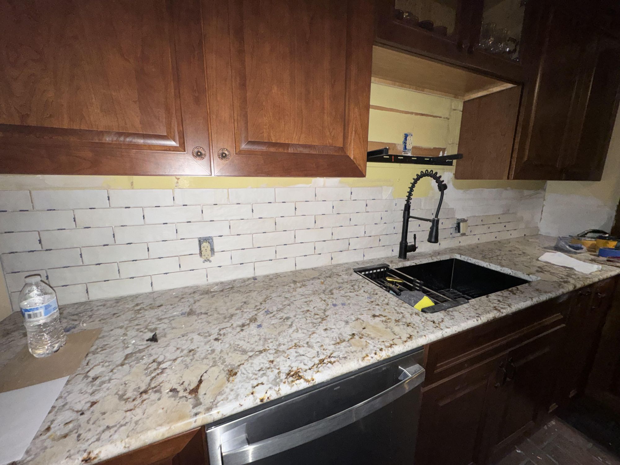
Someone on Reddit called it “tile purgatory.” White subway tile going up over warm cherry cabinets and a busy gold-and-brown granite, mid-install, and they couldn’t tell anymore if it was working.
It was working. They just couldn’t see it yet, because the two things that make this combination land hadn’t happened. Here’s how to read it, so you can trust the choice while you’re still in the mess.
Why white subway tile and cherry cabinets work together
Cherry is a loud wood. The grain is busy, the color is a deep red-brown, and it pulls the eye. Put a warm, patterned tile next to it and the two fight. Put a cool, bright, simple tile next to it and the cherry gets to be the star. (If you’re still deciding on the cabinets themselves, you can see your cabinets in a different color first before you commit to a backsplash around them.)
That’s the whole job of white subway here. It’s not trying to be interesting. It’s giving your eye a place to rest between two busy elements, the cherry grain on one side and the granite’s gold-and-brown movement on the other. The tile is the quiet in the room. That contrast is the point, not a compromise.
So if your white subway looks “boring” next to your cabinets, that’s not a problem. That’s it doing its job.
The grout is doing more than you think
Here’s what makes a backsplash read as finished instead of unfinished: the grout lines.
When the grout is uneven and dark, your eye can’t find the grid. It reads the wall as noise, a bunch of rectangles that don’t line up. That’s the “purgatory” feeling. Your eye is hunting for a pattern and not finding one.
Clean, even, bright grout flips it. Suddenly the courses read as a deliberate grid. The same tile, the same wall, but now your eye locks onto the pattern and the whole thing snaps into “intentional.” Nothing else changed. The tile was always fine. The grid just became legible.
This is why you can’t judge a backsplash mid-grout. You’re looking at noise and asking it to look like a pattern. Wait for the grout.
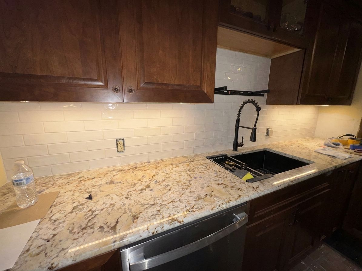
What we told RAI: Finish the subway tile, clean even grout, add warm under-cabinet lighting.
Read that instruction back. It names three things: finish the grout, keep it even, light it warm. Those are the three levers in this kitchen, and not one of them is the tile. The tile was never the question. Once you can name the levers, you can call the move yourself.
Here’s the photo from mid-install, grout half-done, the exact moment that feels like a mistake:
And here’s what came back when RAI ran those three levers, finished grout, warm light, cherry still the star, before anyone spent a weekend second-guessing it:
See your own kitchen with the tile finished and lit, free, in about 20 seconds. Snap one photo →
Under-cabinet lighting is the move people skip
The second thing that makes this kitchen land has nothing to do with the tile. It’s the light.
Cherry cabinets are dark. They absorb light. In a kitchen with dark cabinets, the backsplash is the brightest vertical surface in the room, which means it’s where light wants to live. Add warm under-cabinet lighting and two things happen at once: the white tile pops against the dark cabinets, and the warm glow pulls out the gold tones in the granite, tying the whole palette together.
Without the light, the backsplash sits flat and the granite’s gold reads as random. With it, the room reads as one warm, deliberate palette. It’s the cheapest high-impact move in a cherry kitchen and it’s the one people leave for “later.”
Look at the before and after again. The tile choice was right the whole time. The grout made it legible. The light made it warm. None of it was a different tile.
How to read your own backsplash mid-install
Next time you’re in tile purgatory, run these three checks instead of panicking:
- Is the grout done and even? If not, you’re looking at noise. Don’t judge it yet.
- Does the tile contrast your cabinets, or compete with them? White subway against cherry is contrast. That’s good. Two busy warm things side by side is competition.
- Where’s your light? If the backsplash is the brightest plane in a dark-cabinet kitchen and it isn’t lit, you’re not seeing the finished version yet.
You don’t need design school to know if a room is working. You need to know what to look at.
Frequently asked questions
Does white subway tile go with cherry cabinets? Yes. White subway is a cool, simple neutral that lets warm cherry be the focal point instead of competing with it. The contrast is what makes both look intentional.
Why does my backsplash look bad mid-install? Almost always the grout. Uneven or dark grout keeps your eye from reading the tile grid as a pattern, so the wall looks like noise. It usually resolves the moment the grout is clean and even.
What backsplash goes with busy granite? A simple, low-pattern tile like white subway. Busy granite already gives the eye a lot to do. A quiet backsplash balances it instead of doubling the visual noise. (Cream or lighter cabinets change the answer if your kitchen isn’t cherry.)
Do I need under-cabinet lighting with dark cabinets? It’s the highest-impact cheap upgrade in a dark-cabinet kitchen. The backsplash is the brightest surface in the room, and lighting it makes the tile pop and warms the surrounding tones.
Run the three checks on your own backsplash. Not sure you read it right? Snap a photo, tell RAI what you’re seeing, and check your call against the finished kitchen before you commit a single weekend to it.