Flat White House Paint Color Ideas: 3 AI Directions on a Real Home
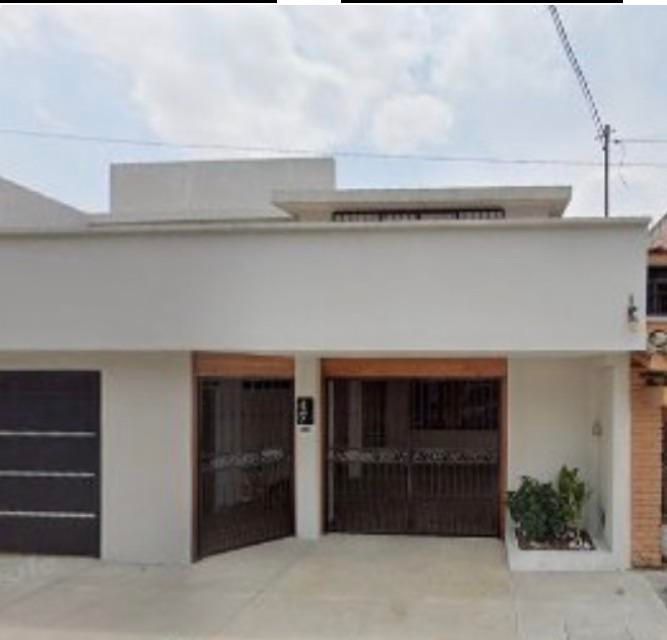
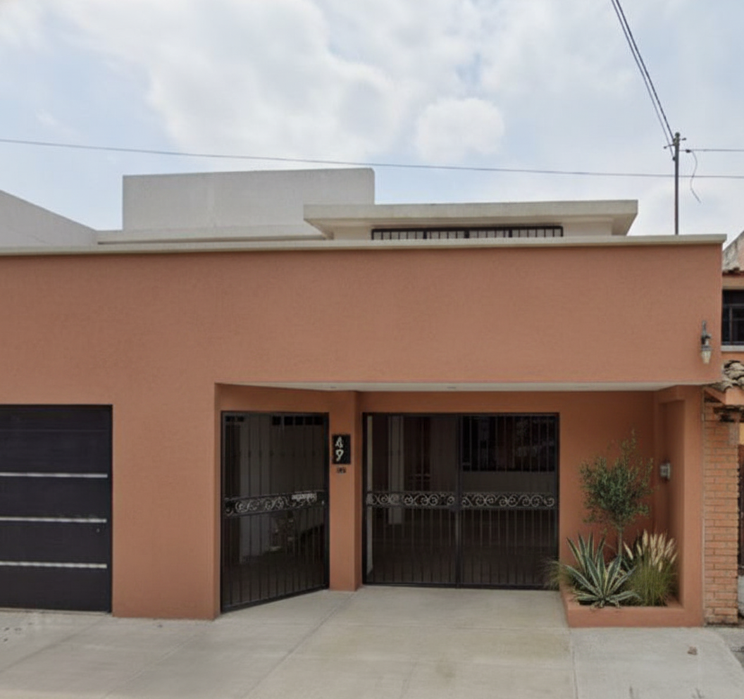
A homeowner posted her house on Reddit. She’d painted it bright red, then painted the whole thing white, and now thought it looked flat and boring. She tried ChatGPT for paint ideas. The colors looked okay. The house in those images was a different house. Wrong gate proportions. Hallucinated planters. A porch that did not exist.
That is the problem with most AI design tools. They generate a similar house, not your house. So I opened her actual photo in Renovate AI (RAI) and tested 3 paint directions. Same gates. Same parapet. Same roof. Just color and landscaping.
What’s Going On With This House
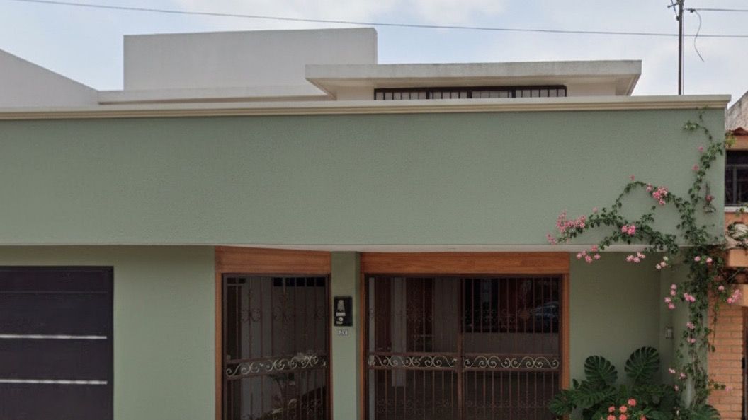
It is a flat-roof modernist home. Two iron security gates, one garage door, raised parapet, a strip of clerestory windows up top. Good bones. The all-white made it read like a model, not a home. Nothing for the eye to land on.
She mentioned she loved a lavender option but worried it would look tacky. She also said green and flowers were “very much needed.” So the question was not “what color?” The question was 3 questions. Can lavender land without going tacky. Does sage actually warm this up. Does terracotta nod to the original red without going loud.
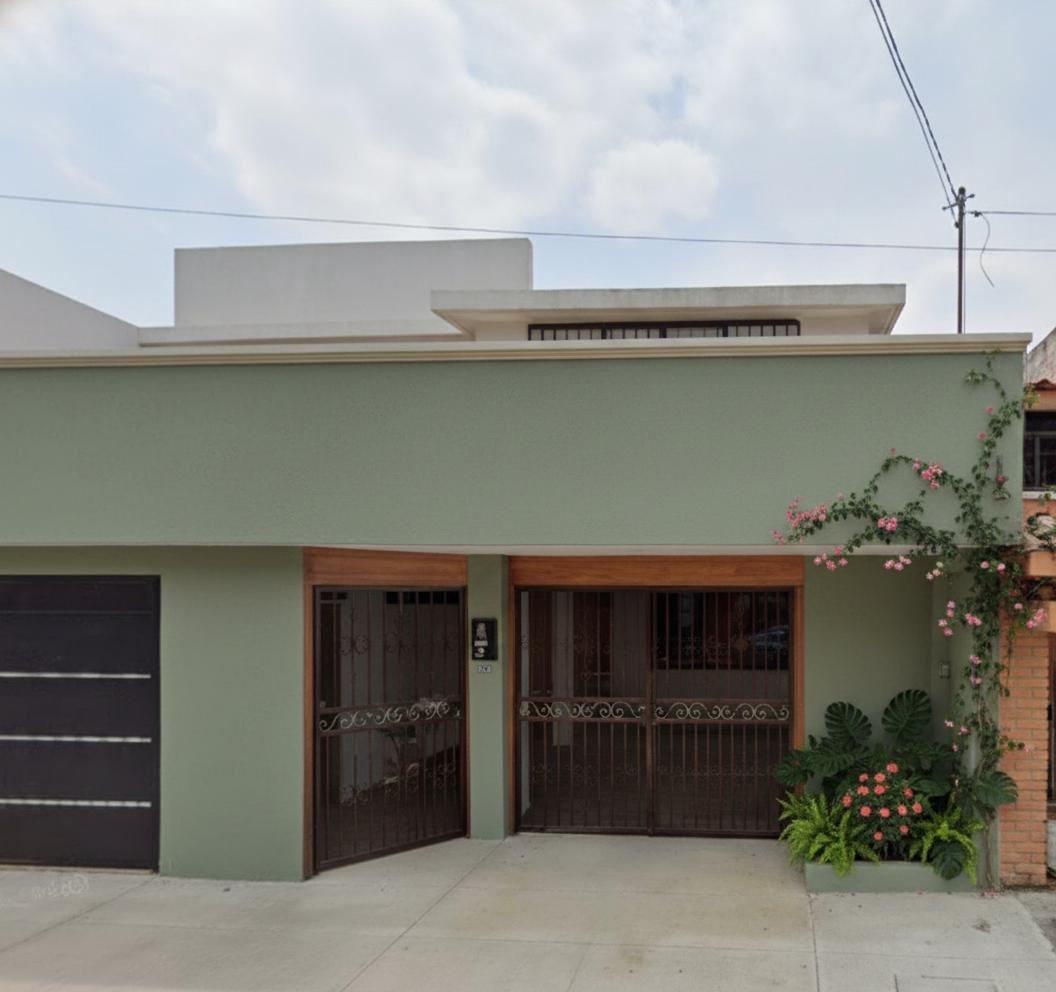
Direction 1: Soft Sage Green + Wood-Frame Gates + Flowering Vine
Keep the gates. Keep the parapet. Change the wall color to a soft sage. Refinish the iron gates with warm wood frames. Add a flowering vine over the entry.
What we told RAI:
“Soft sage green walls. Warm wood frames on the iron gates. Flowering vine over the entry. Keep the parapet and clerestory.”
Why this works. Sage takes the temperature down without going dark. The wood on the gates is the move. It breaks up the iron, adds warmth, makes the entry feel like an invitation instead of a security wall. The flowering vine is the smallest change with the biggest emotional return. Green and flowers, as she asked.
This is the safest pick. Easiest to live with. Easiest to sell to a partner who is nervous about color.
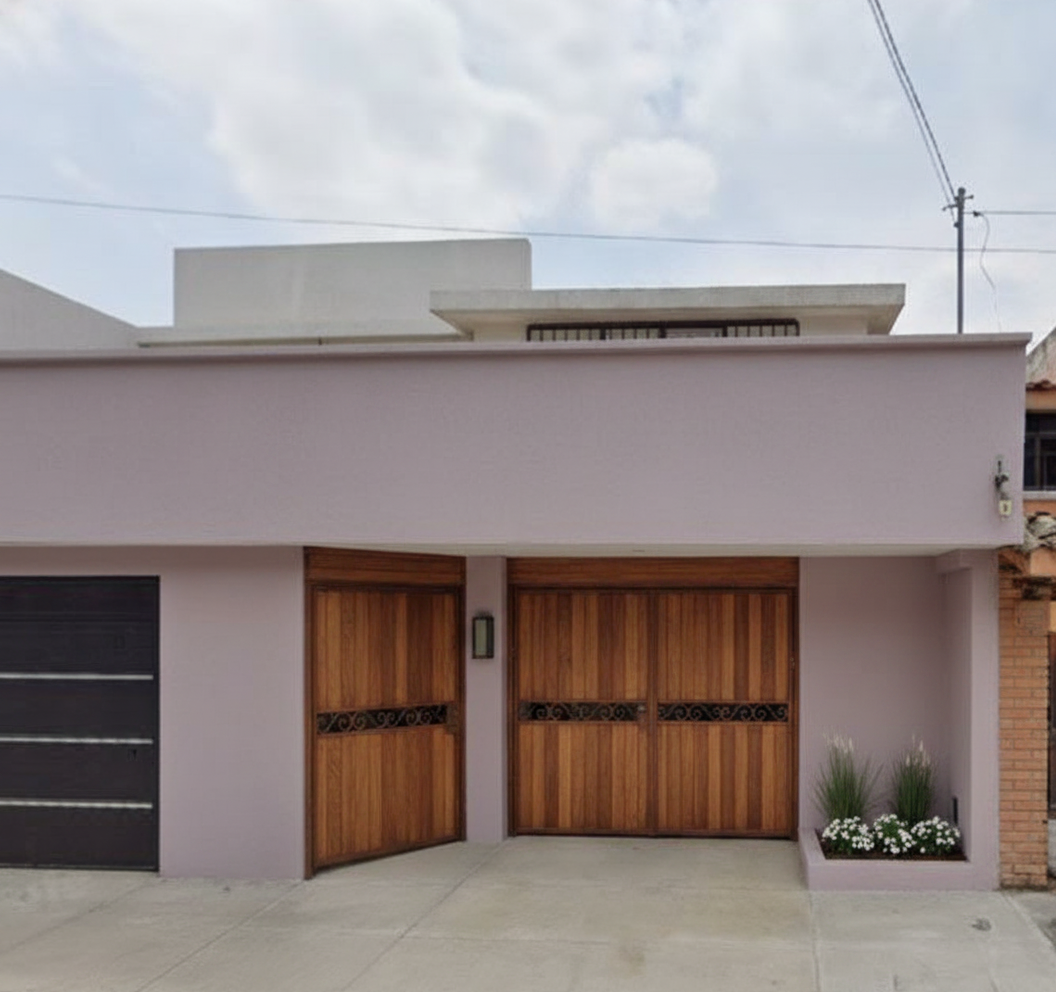
Direction 2: Refined Dusty Lavender + Walnut Wood Gates
The lavender she loved, done with restraint. Soft dusty lavender on the walls. Warm walnut wood replacing the painted iron of the gates. Nothing else loud.
What we told RAI:
“Refined dusty lavender walls. Walnut wood gates. Keep the layout. No accent colors.”
Why this works. Lavender goes tacky when it is bright or when it competes. A dusty, low-saturation lavender reads almost grey in some light. The walnut grounds it. Two materials, two tones, no third thing fighting for attention. That is how purple stays sophisticated on a house exterior.
One note. RAI swapped the see-through iron gates for solid wood here. If you love the iron character of your real gates, ask to keep them. Same lavender works with iron in walnut tones.
Direction 3: Muted Terracotta + Cream Trim + Black Iron Gates
A nod to the original red without the brightness. Muted terracotta walls. Cream trim on the parapet. Keep the black iron gates as-is. Agave on the side planter.
What we told RAI:
“Muted terracotta walls. Cream trim on the parapet. Keep the black iron gates. Agave on the right planter.”
Why this works. This is the regional answer. Terracotta lives next to this architecture without trying. The cream trim does what white could not. It outlines the parapet so the building has structure instead of one flat surface. The black iron gates stay. They look intentional now, not awkward.
Pick this if you miss the red but want to grow up the palette.
Which Direction Fits Your Home
All 3 start from the same flat white house. All 3 keep the gates, the parapet, the garage, the windows.
Pick sage if you want the most warmth for the least risk. Paint and a planter. A weekend.
Pick lavender if you want the house to feel personal. Lower saturation is the trick. Hire a painter you trust to color-match on a sample wall before you commit.
Pick terracotta if you want the house to sit in its neighborhood. Best for warm climates and flat-roof architecture. Cream trim is doing real work here.
How These Came Together
I opened her photo in Renovate AI and told RAI what to change and what to keep. Each image came back in about 15 seconds.
The trick on exteriors is naming what stays. “Keep the parapet and clerestory” matters more than “make it sage.” RAI keeps the structure the same when you tell it what to anchor. That is what most AI design tools miss. They give you a different house. You want your house, just painted differently.
You can get more specific if you want. Down to exact paint color names, wood species on the gates, plant species. You can even upload your own paint chips from the Imagination Library and RAI designs with your exact color. You do not have to.
If you want to dig further on the broader question, here is the long answer: is there an app to see what your house exterior would look like painted.
See What Your Home Could Look Like
If you painted your house a color you now regret, open your space in Renovate AI and tell RAI what you would change. See it in seconds. Free to try.
3 directions. Same house. One of them is yours.
Inspired by a real question on r/ExteriorDesign. A homeowner who painted her house white and missed the color.
Made with Renovate AI. Open your space, tell RAI what you would change, see it in seconds.