How to Make a Gray House Feel Warm: 3 Color Directions for a Victorian Exterior
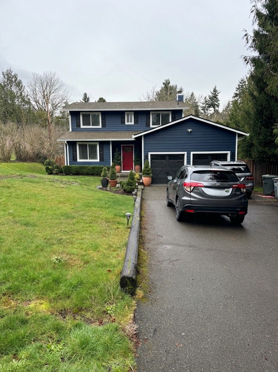
A homeowner posted their three-story Victorian on Reddit, asking: “Any ideas for making my home more warm and welcoming?” They hated the all-gray siding. Forty-one comments followed, most suggesting landscaping — but nobody showed what a color change would actually look like.
So we did.
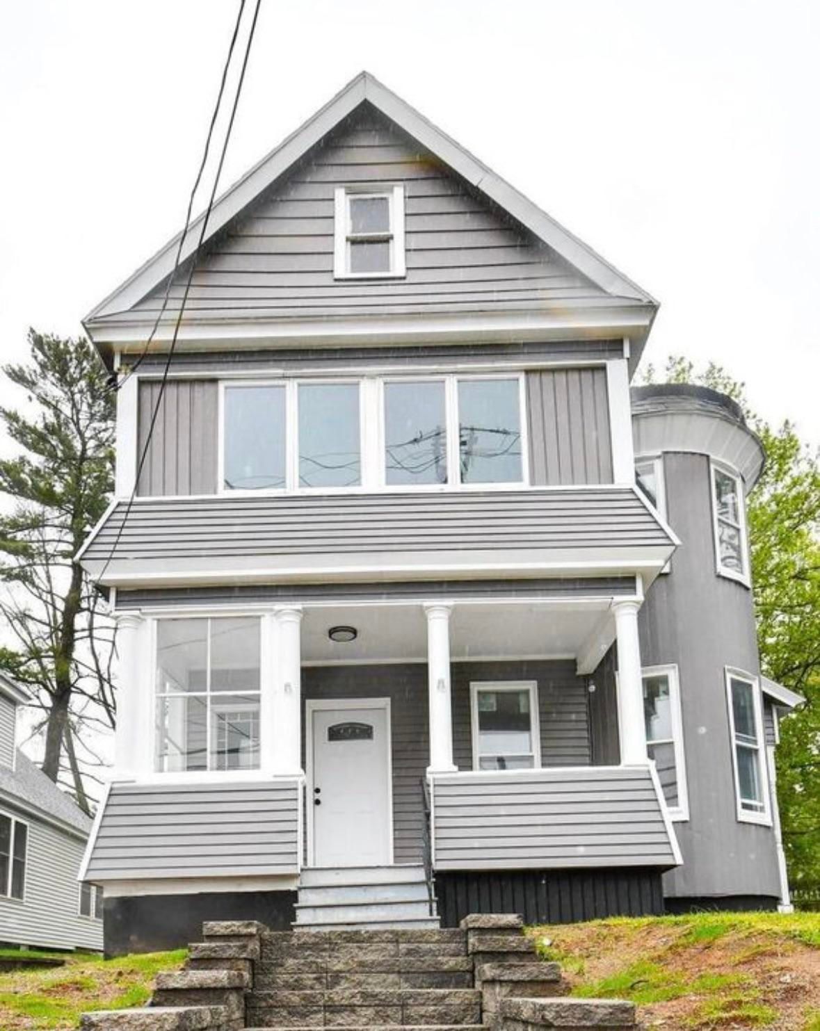
The Challenge
This house has beautiful bones. A covered porch with classic columns. A turret on the right side. A peaked dormer gable. Solid stone steps leading up to the front door.
But every surface is the same flat gray — siding, trim accents, board-and-batten panels. There’s no contrast, no warmth, and zero landscaping. The result feels institutional. Cold. Like a house that hasn’t decided what it wants to be.
The bones are there. The personality isn’t.
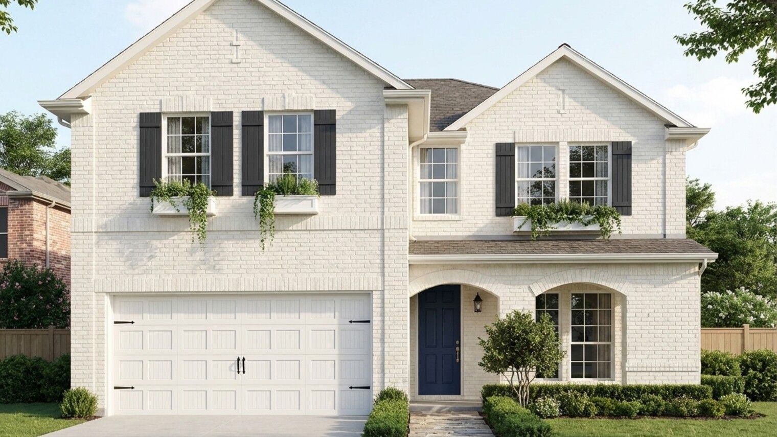
Direction 1: Warm Cream Colonial
The most natural move. Swap the gray for warm creamy white and let the architecture do the talking.
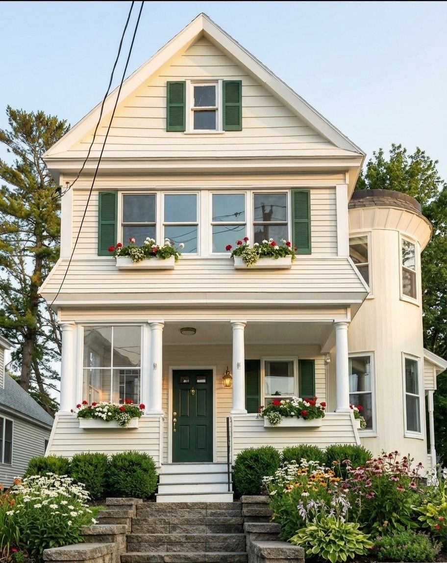
What we told RAI:
“Creamy white siding. Forest green shutters. Hunter green front door. Window boxes with red and white flowers. Boxwood foundation plantings.”
Free · No account needed · 10 seconds
Why this works: The warm cream doesn’t fight the Victorian proportions — it lets them breathe. Green shutters create the contrast that gray was killing, and window boxes add the human touch that says “someone lives here and cares.” The foundation plantings alone transform the base from bare dirt to finished home.
Direction 2: Sage Craftsman
Bolder move. Lean into color with sage green siding and warm accents that reference the craftsman era.
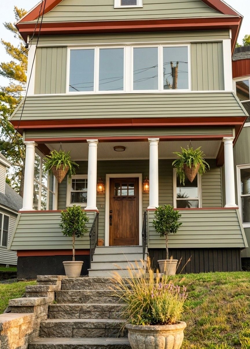
What we told RAI:
“Sage green siding. Rust-red trim accents. Walnut wood front door. Copper porch lights. Hanging ferns and ornamental grasses.”
Free · No account needed · 10 seconds
Why this works: Sage green reads warm where gray reads cold — same lightness, completely different feeling. The rust-red trim ties into the copper lanterns and creates a warm accent layer. A real wood door with iron hardware grounds the whole thing. This direction says “cottage” more than “colonial.”
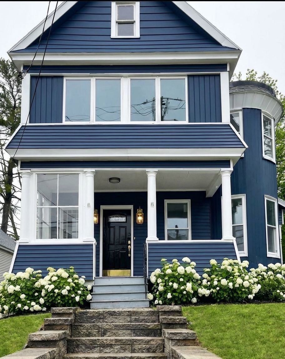
Direction 3: Navy Statement
The bold option. Deep navy body with crisp white trim — period-appropriate for Victorians, dramatic from the street.
What we told RAI:
“Deep navy blue siding. Keep the white trim and columns. Glossy black front door. Brass porch lights. White hydrangea foundation plantings.”
Free · No account needed · 10 seconds
Victorians were originally painted in deep, saturated colors — navy is historically accurate, not trendy. The white trim pops against navy in a way it never could against gray. Hydrangeas add softness without competing with the color story. This is the direction for someone who wants their house to be the one people slow down to look at.
Which Direction Fits?
It depends on the neighborhood and the energy you want.
Cream colonial if you want universally warm and welcoming. Safest for resale. Plays well in traditional neighborhoods where you don’t want to be the loudest house on the block.
Sage craftsman if you want personality without shouting. Works especially well on streets with mature trees — the green plays off the trees around it. More distinctive than cream, less committal than navy.
Navy is for someone who wants presence. Best on well-lit streets where the color reads clearly. Victorians carry deep color better than almost any other style — the trim detail gives navy somewhere to go.
All three fix the same core problem: the gray was erasing every detail this house has.
How We Made These
I opened the house in Renovate AI and told RAI what to change — and what to keep exactly as-is. Each design came back in about 30 seconds.
The trick is telling RAI what you love first. “Keep the white trim and columns” anchors the whole design. Then you guide the color, the landscaping, the hardware. RAI preserves the architecture — same turret, same porch, same stone stairs — and shows you what changes with color alone.
The biggest insight from this one: landscaping does as much as paint. Every direction includes foundation plantings because that bare dirt slope was half the coldness problem. Color without landscaping is half a transformation.
That’s what an exterior visualizer should do — show your actual house, not a generic stock photo.
You can get more specific if you want — down to exact paint brand, hardware finish, planter style. You can even upload your own swatches and paint chips. But you don’t have to. Short directions work.
See What Your House Could Look Like
If your exterior feels stuck in a color that isn’t you, try it yourself.
Open your space in Renovate AI — free to try.
Inspired by a real question on r/ExteriorDesign. Original post.
Made with Renovate AI — open your space, tell RAI what you’d change, see it in seconds.
You Might Also Like
Is There an App Where I Can Change Home Color for Free? →
See Your Home’s New Exterior Before You Renovate—With AI →
We Used AI to Paint a Gray Split-Level 3 Ways. The Garage Door Changed Everything →
How to Make a Boring Red Brick House Look Sharp — 3 Directions We Tested →