How an Exterior Paint Visualizer Transformed a Desert Stucco Home
A homeowner on r/ExteriorDesign posted their single-story stucco ranch with a common desert suburb problem: tan stucco, green gable siding, and a feeling of “still pretty blah.” They wanted to replace the green siding in the gable peaks, were considering a yellow front door, and were open to a full color scheme overhaul.
14 people weighed in. The advice ranged from “paint it all gray” to “add shutters.” One person even posted a render. But nobody addressed the real issue. In a neighborhood where every house is tan stucco, how do you stand out without fighting an HOA?
We used Renovate AI as an exterior paint visualizer to test three different directions on their actual home. Same bones. Three completely different personalities.
The Before
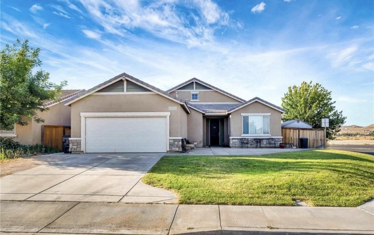
Tan stucco body. Green board-and-batten in the gable peaks. White garage door. Stone veneer at the entry. Standard desert subdivision — the kind of house that blends into the block.
The green siding is the obvious first target. But the bigger unlock is something nobody in the thread mentioned.
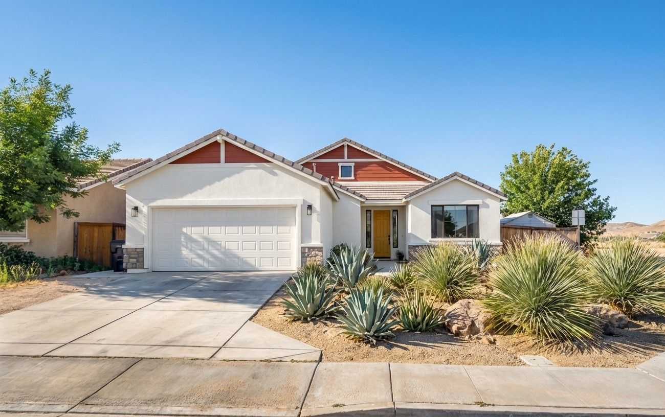
Direction 1: Desert Contemporary — The Hero
What we told RAI: “Warm white stucco body. Terracotta rust-red boards in the gables. Deep saffron yellow front door. Dark bronze window frames. Desert landscaping with agave and ornamental grasses.”
This is the direction that earns the house a second look from the street.
Warm white stucco — think Benjamin Moore White Dove — does something counterintuitive in desert neighborhoods. When every house is tan, white reads brighter without reading cold. Against a desert sky, it reflects light instead of absorbing it. The house appears larger and more intentional.
The trick: warm white, not bright white. Bright white in direct desert sun creates glare and looks institutional. That slight yellow undertone lets it sit naturally next to sand-colored neighbors.
Terracotta gables replace the green siding in a way that honors the region. It’s the color of the desert floor — clay, iron oxide, dried earth. Against warm white, it reads as a deliberate accent, not an accident. This is where an exterior paint visualizer earns its keep. Terracotta can swing from elegant to dated depending on the exact tone. Seeing it on your actual house removes the guesswork.
The saffron door? The homeowner’s instinct was right. Warm golden mustard picks up the terracotta warmth and concentrates it at the entry. Says “front door” from the street without screaming.
Direction 2: Modern Desert Minimal
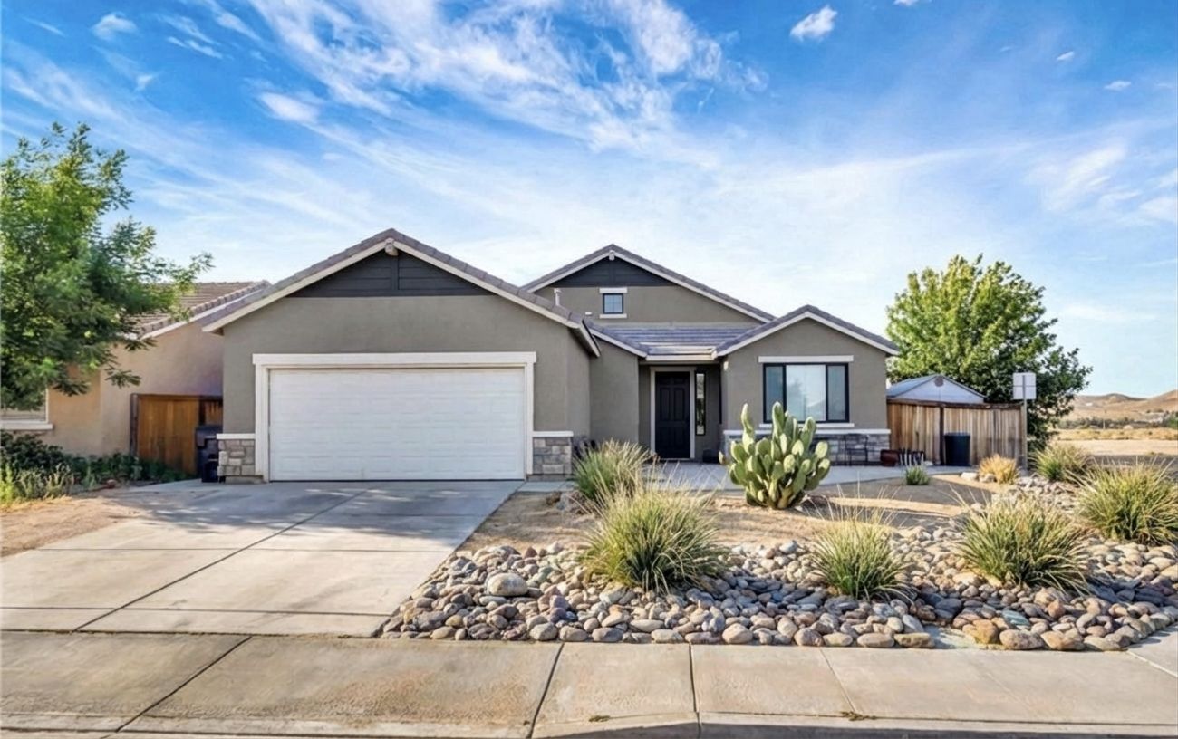
What we told RAI: “Warm medium gray stucco body. Dark charcoal horizontal planks in the gables. Matte black front door. Matte black window frames. Desert landscaping with river rocks, low grasses, and a single specimen cactus.”
The cool-toned counterpoint. Chelsea Gray stucco with black accents reads sharp and current. This is the direction for someone who wants their house to look like it belongs in a design magazine rather than a desert postcard.
The charcoal planks in the gables do the same job as the terracotta in Direction 1 — they replace the green siding with something intentional. But where terracotta warms, charcoal sharpens. The house reads more architectural, less organic.
River rock and gravel landscaping with a single specimen cactus is the minimal approach to xeriscaping. Clean lines. Low maintenance. The kind of front yard that looks composed at every hour of the day.
The risk with this direction: gray can read flat in desert light. The matte black accents prevent that by creating contrast points. Without them, this palette washes out by noon.
Direction 3: Southwestern Revival
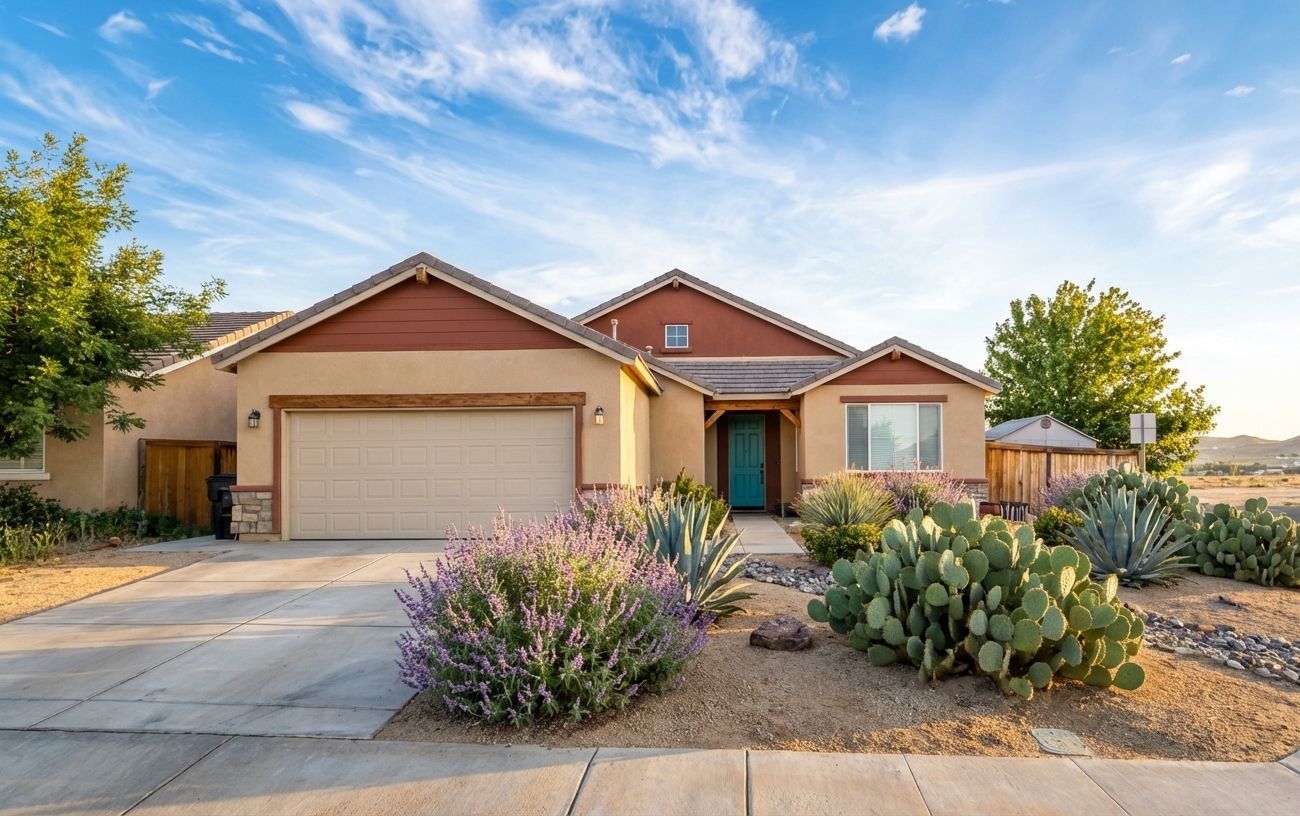
What we told RAI: “Warm sand beige stucco body. Deep terracotta clay-colored gable stucco. Turquoise front door. Desert garden with prickly pear cactus, desert sage, and decomposed granite ground cover.”
The one that leans into place. Sherwin-Williams Cavern Clay on the gables, turquoise at the door, prickly pear and sage in the yard. Every element says “I live in the desert and I’m not apologizing for it.”
This direction keeps the warm stucco tone closest to the original — the body color barely changes. What changes is the confidence. The deep terracotta gables create a visual anchor at the roofline. The turquoise door is the complement — warm earth tones against a cool accent that pops without fighting.
The desert garden here is the most complete of the three directions. Prickly pear, agave, desert sage, decomposed granite paths. It looks established, like the house grew into its landscape rather than being dropped onto a lawn.
For desert homeowners who don’t want their house to look like it was transplanted from a coastal suburb, this is the direction that feels most authentic.
Which Direction Works Best?
It depends on what you want the house to say.
Direction 1 (Desert Contemporary) if you want the house to stand out on the block. High contrast, warm palette, magazine energy. The saffron door is a conversation starter.
Direction 2 (Modern Minimal) if you prefer clean and sharp. The gray-and-black palette reads sophisticated but needs the right desert light to avoid looking flat. Best for newer construction with clean stucco lines.
Direction 3 (Southwestern Revival) if you want the house to feel like it belongs exactly where it is. The most regionally honest option. Least likely to clash with HOA earth-tone requirements.
One thing all three directions share: desert landscaping. In every render, swapping the lawn for native plants was the single biggest transformation. It kills the “transplanted suburb” look and anchors the house in its actual geography. Less water. Less maintenance. More character.
The Design Principle: Regional Honesty
The mistake most desert homeowners make isn’t picking the wrong color. It’s pretending they don’t live in the desert. Grass lawns, cool-toned palettes, coastal-inspired accents — they fight the setting instead of working with it.
All three of these palettes work because they agree with the environment in different ways. The best exterior transformations don’t impose a style. They work with what’s already there.
How We Made These
We opened the original photo in Renovate AI, described each direction in plain English, and had all three results in under ten minutes. No Photoshop. No contractor consult needed before knowing what the finish line looks like.
The exterior paint visualizer shows you the answer before you spend a dollar on primer.
See What Your Home Could Look Like
If you’re staring at your exterior and feeling what this homeowner felt — the bones are fine but the palette needs direction — this is what the app was built for.
Upload a photo. Tell RAI what you want to change. See the result in seconds.
Inspired by a real question on r/ExteriorDesign. All images generated with Renovate AI.
You Might Also Like
AI Remodel: See Your Home Renovation Before You Spend a Dollar →
3 AI Landscape Designs That Transform a Boring HOA Front Yard →
AI Bathroom Design: We Gave This Dated Builder Bathroom 3 Completely Different Directions →
What Color Should You Paint a Front Door on a Gray Brick House? →