Sage vs Forest vs Olive: Green Kitchen Cabinets Tested with AI
A homeowner on r/kitchenremodel posted a question a lot of people have. They were torn between sage green and deep forest green for their kitchen cabinets. The fear was specific: “I’m worried the dark green will make everything feel small.”
34 people weighed in. Opinions split hard. The thread turned into a debate without a resolution, because nobody could actually see what either option would look like in their kitchen.
We built Renovate AI for exactly this. We took their kitchen and rendered three green directions: forest green, sage green, and olive green — all with white quartz countertops, bronze hardware, warm white walls.
Here’s what we found.
The Challenge: Why Choosing Green is Hard
Green is the most emotionally loaded color in kitchen design right now. Everyone wants it. Most people are scared of it.
The specific fear — dark cabinets making a kitchen feel small — is legitimate. But it’s also usually misdiagnosed. One comment in the thread put it well:
“The fear about dark green feeling small is usually a floor problem, not a cabinet problem. Dark cabinets plus light oak floor reads open. Dark cabinet plus dark floor together closes things in.”
Free · No account needed · 10 seconds
That’s the real question. Not “is dark green too dark?” but “what’s going on with the floor?”
Dark above, light below = grounded. The kitchen breathes.
Let’s look at all three directions.
The Before
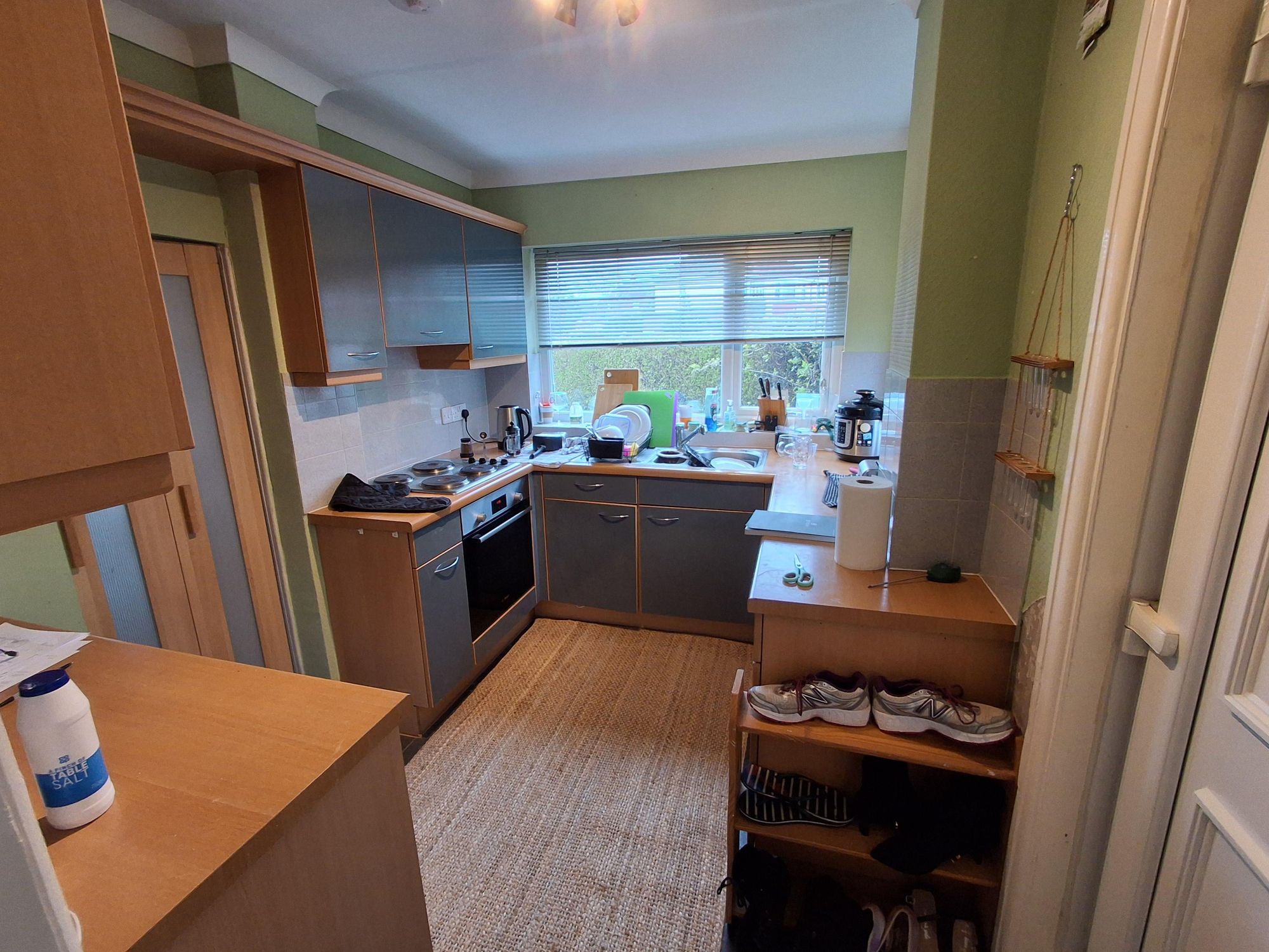
This is where the project starts. Mixed cabinets, green walls that are close to sage but a little murky, white quartz already in place. The bones are solid. The color just hasn’t found its direction yet.
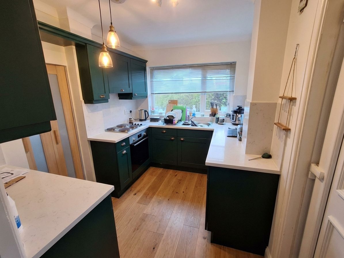
Direction 1: Forest Green — The Hero
What we told RAI: “Hunter green cabinets. White counters. Light oak floor. Bronze pulls.”
This is the one they were afraid of. Farrow & Ball Studio Green territory — deep, rich, magazine-worthy.
What the image shows: the kitchen doesn’t shrink. It anchors. The light oak floor does exactly what that Reddit commenter described — it keeps everything from closing in. White counters and warm white walls push the space back out.
This is the direction that makes the kitchen feel intentional. Not trendy. Not safe. Done.
The fear of dark cabinets is usually about contrast. This image shows high contrast working in the kitchen’s favor. The space looks bigger in the render than the original. Now there’s a clear relationship between surfaces.
Direction 2: Sage Green — The Safe Choice
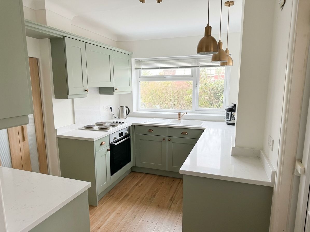
What we told RAI: “Soft sage green cabinets. White quartz. Warm white walls. Bronze hardware.”
Benjamin Moore Pale Sage. This is what most people default to, and it’s not wrong. Soft, airy, transitional. The kind of kitchen that reads as fresh without making a statement.
If the goal is longevity and broad appeal — staging for resale, or a household that isn’t ready to commit to drama — sage is the play. It’s a neutral-adjacent green that works with almost anything.
What it doesn’t do is stop you in the doorway. The kitchen looks nice. It doesn’t look like it has a point of view.
Direction 3: Olive Green — The Middle Ground
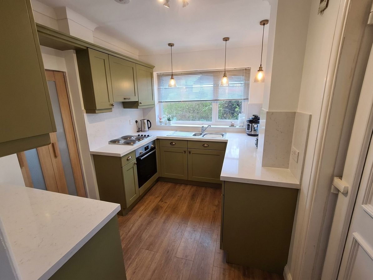
What we told RAI: “Olive green shakers. White counters. Warm wood floor. Aged bronze.”
Benjamin Moore Dried Thyme. Warmer than sage, less saturated than forest green. This is the direction most people don’t think to consider.
The warm wood floor here does something different than in the forest green render — with olive cabinets it reads organic and earthy rather than dramatic. If the household tends toward natural materials, this direction bridges the gap between playing it safe and committing to color.
It’s the right pick if you love the richness of forest green but the white walls in your actual space are warmer than they look on a monitor.
Which Direction Works Best?
It depends on one thing more than anything else: the floor.
Light oak or white oak floor — go forest green. The contrast works. The kitchen earns its drama.
Warm wood mid-tone floor — olive reads the most cohesive. The warm tones align and the space feels layered.
Lighter floor, less contrast preferred — sage. It’s the graceful exit from bold color while still landing somewhere deliberate.
One honest note: the “small kitchen” fear didn’t show up in any of the three renders. The kitchen has decent ceiling height and white counters. The floor choice matters far more than cabinet darkness.
How We Made These
This whole process took about 10 minutes.
We opened the original kitchen image in Renovate AI, typed what we wanted to change in plain language, and let the app generate the result. No design software. No Photoshop. No contractor quote required before knowing what the finish line looks like.
The Imagination Library inside the app has a full catalog of paint colors, materials, hardware finishes, and flooring options. You can browse to get the vocabulary if you need it — or just describe what you’re after in plain terms and tell RAI what to change.
“Hunter green cabinets. White counters. Light oak floor. Bronze pulls.” That’s it. That’s the whole input.
The gap between that sentence and what you see in the forest green image is what Renovate AI does.
See What Your Kitchen Could Look Like
If you’re looking at your kitchen and feeling what this homeowner felt — the color is almost right but you need to see it before you can commit — this is exactly what the app is for.
Upload a photo. Tell RAI what you want to change. See the result in seconds.
Inspired by a real question on r/kitchenremodel. All images generated with Renovate AI.